 Got a request from Ash Aravind to either make a Youtube clip or write an article on my blog about mixing blues. Thanks for the tip, Ash. I'm a bit busy at the moment, so the clip will have to wait.
As you may have noticed, blue is a pretty important color in my work, so I have quite a few different shades of it, ranging from cold greenish to warm purple-like blues. I practically never use it straight from the tube, I always mix it with other blues, sometimes even with yellows or reds. And of course with titanium white, always titanium white. The only one I sometimes apply straight from the tube is kings blue light.
I also mix them by using transparent layers. Usually my colors are thinned down, so I need multiple layers to get the color intensity I'm looking for. I use this transparency to create very deep, intense blues. Not necessarily dark blues, but the transparency creates an interaction between the different layers that adds to the intensity.
For example: in the bottom layer I sometimes paint a smooth surface of ultramarine. When this layer is dry I paint a mix of cobalt and Caribbean blue on top of it. The Caribbean blue gives the cobalt a greenish hue, which tones down the much warmer ultramarine. I sort of accidentally stumbled across this combination and I was struck by its intensity, even when mixed with white.
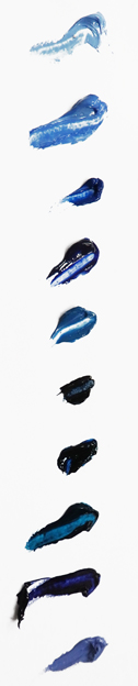
These are the blues I use in order of appearance:
1. kings blue light
2. kings blue dark
3. cobalt blue
4. ultramarine blue
5. ceruleum blue
6. indigo
7. Prussian blue
8 Caribbean blue
9. Old Holland blue-violet
10. Old Holland violet-grey
There are of course many more blues on the market. This is just my personal selection. Next time I'll tell a bit more about what I use each color for. If you like to receive my complete color list (including the reds & yellows), please send an email to info@janhendrikdolsma.nl and I'll send you the list asap.