
Anyway, for some reason I thought I'd try a grey background for a change. After applying it I got my cloth and 'drew' the clouds in the wet grey paint. At this point the painting looked like this:
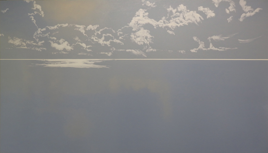
And now it looks like this:
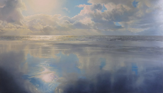 |
| Sun in the Water, 33.5 x 59", oils on panel |
I really liked the experience. The grey ground immediately unifies everything you do on top of it. The down side (like fellow-painter Dave Smith pointed out) is that your colors may not turn out as bright as with a white background. I wouldn't use it for a sunny beach scene. It's probably best suited for paintings with a soft atmosphere, like this one. I will certainly use it more often!
Great share and observation ,it this explains a lot ,Thank you,JHD!
ReplyDeleteGood to hear this is helpful. Are you going to ry it too?
DeleteSomehow it happens ,yes,i do two pictures at this time (now i mean)discovering with gray under it...but my goal is to figure out how much gray i need for different time of the day...no matter how meny layers of oil on board or canvas the gray tone dominate and giving soft dusty pale looks to lights but dark tones gets darker when dry...i read that a lot landscape painters in 19 th century where using grey for blocking..outside(less flashing white canvas)
Deletebut i was mentioned gray gray(silver gray?)...as i learned by now there is a lot other gray tones and its seems to be best way to go with color composition of future picture/'s
DeleteYou're right, a grey background is probably best for what you call a 'soft, dusty look'. Somehow the grey always shines through the upper layers. That's probably why the nineteent century Pre-Raphaelites started using white backgrounds. Their paintings look very fresh compared to work of their contemporaries.
DeleteI wonder if it will be a different experience if it's a ready to use toned gray panel instead ( as opposed to using gray paint to tone it and then painting white on top although there may not be any difference once the gray layer dries) My only experience so far is with using gray toned paper and in that when I use white color pencils or ink or paint etc, the white actually seems brighter.
ReplyDeleteI do have gray toned hardboard panel at hand which I'm planning to try a seascape.. I'll see how that goes:)
Hi Asha, good to hear from you. Yes, there is a difference. I adapted the grey I used to the image I wanted to paint on top of it. It's a mix of violet-grey and Naples yellow. Because I work in transparent layers the grey will shine through. Let me know how your experiment with the grey toned hardboard goes!
ReplyDeleteAh! That makes sense; Thankyou!
DeleteI'll write back once I try!
Looking forward to hear about your eexperiences!
DeleteHi,
ReplyDeleteI just stumbled upon your paintings and am really astonished of what a Master you are!And thank you so much for sharing so generously!
I have one question as I understand you are working with oil. What kind of painting medium are you using for the glazing? I used to do oil painting 'hundred years ago', but never really got the grip of the glazing, since there's the risk that the underlaying layers may be hurt by the next glazing layer. I would very much appreciate if you would say a few words about this.
Does your videos go more into the spesific technical aspects - like this - as well,and maybe recipes, - or do they primarily focus on how to 'handle' the paint and the brushes?
Best of wishes, and thanks:-))
Hi Esmeralda,
DeleteThank you for your kind words. I'm using Liquin (a Winsor & Newton brand) as a medium. It's a fast drying medium, so you don't have the problem you mention with regard to underlaying layers. In my Painting Clouds video I go into the technical aspects of glazing and the use of Liquin. If you want to know more, please go to www.paintingskies.com/video. Thanks!
Hi Janhendrik,
ReplyDeleteThank you so much for your fast reply!:-)
Do you use Liquin 'undiluted' in all the glazing layers, or do you dilute more at first - then and less and less for each layer (as in the fat on lean principle)?
Ok, I will order the video, for sure. :-)
I also have another question after having watched more of your 'recent paintings'. I wonder if the detail pictures are from earlier stages in the work process,or if they are from the finished painting?
Do you use photographed motifs to 'lean on' during the process, or do you only follow sketcehs you make directly from nature?
Or are you able to make this marvellous landscapes - seascapes - skyscapes simply 'by heart' - without any spesific motif in front of you as you paint along?
Whatever the right answer may be, I am deeply impressed by your level of mastery!
Thanks again and all the best!
Hi Esmeralda,
DeleteI use Liquin in every layer. The fat over lean principle doesn't apply with Liquin. In my recent February 5 blog entry I wrote about it (The fat-over-lean rule).
The detail pictures on my website are from the finished paintings. I added them to illustrate that they are real paintings. The images on the internet are so much smaller than the real thing that the paintings sometimes look like photographs, instead of real paintings.
I design my work with the help of Photoshop. I make digital collages as a starting point for my paintings. In my most recent work I rely more and more on my 'heart'. I made a Youtube clip about the use of the computer: https://youtu.be/4lUfO1mP2hw.
Hope this answers your questions!
Janhendrik
Hi - and thanks so much again!
DeleteAs I bought the video yesterday, I found some of the answers...I can see that the medium is not diluted...but that the paint gets 'diluted' by more or less liquin...great to know!
I still haven't seen the whole video, I'm looking foreward to continue tomorrow. It's great!
WOW...since the total impression of your paintings seems so soft, it's really unbelievable that the details are from the finished paintings...!
Wow..now I just watched the youtube clip about the computer work...great! Creative solutions! I'm not that good with Photoshop, though, but there's some inspiring input here.:-)
ReplyDeleteDo you know the work of Lars Hertervig? He's been my favourite Norwegian painter of all times. Used to be deeply fascinated with his clouds, maybe that's why I fell for yours, as well.
Maybe you might enjoy to have a look, in case you do not know him: https://upload.wikimedia.org/wikipedia/commons/6/65/Lars_Hertervig_-_The_Tarn_-_Google_Art_Project.jpg
Thanks for the Lars Hertervig link. Deeply Romantic painter and I happen to love Romantic painting.
DeleteIn response to your previous comment: the soft impression of my work is caused by the smooth color transitions in for example the blue of the sky. This gives me a lot of freedom in the other elements, like waves or dunes.