Thursday, January 18, 2018

Dry brush

Those of you who have seen my full length tutorials know that I often start with a midtone when I'm painting clouds. It can either become the shadow part or the bottom layer for the highlights. Then I slowly build up the highlights until I get them just right. With 'Tidal Pool' I took a different approach.
 
Tidal Pool, oil on panel, 35.4 x 47.2"
  
I started by painting the blue of the sky covering the entire surface. Waited a day til it was dry. Painted the midtone, a soft purple-like grey. Waited another day. So far so good.
Normally I would've painted a rather thin layer of Titanium White and a hint of Vermillion Red on top of this layer and repeated that in the next few days, up to the right shade of white.


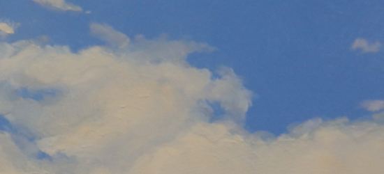
This time I thought I'd try something else. The color mix was the same: Titanium White and a hint of Vermillion Red. The difference: no medium, just pure paint. With a number 30 spalter I bristled the dry paint on top of the bottom layer.The combination of the rough brush and the dry paint worked very well to create a cloud like surface.


I shot the below picture close to the painted surface. Especially on the edges of the highlights it clearly shows the hair-like structure that you get when using this dry brush technique. I left a small zone of the underpainting purple uncovered, to prevent the hard edges that will immediately turn your cloud into an isolated lump. Now it nicely dissolves into the blue sky.


Thursday, January 4, 2018

Framing #2

As some of you may know I paint on 6 mil. MDF board. I order them at Mus-paneel, a small Dutch company, specialized in preparing painting boards. They do an exellent job. Got some secret recipe to make the surface as smooth as ice. After doing their magic they ship the boards to my framer to have them cradled.


The cradle is glued to the back of the board 


Cradling is essential, especially for the larger boards. It provides stability and prevents curvature. But there is another reason. I use floaters as a standard frame and the cradle makes it possible for the painting to be screwed to the frame. (By the way, I love that word, floater. It describes exactly what happens: like your painting is floating in its frame. The Dutch term is less poetic: 'baklijst'. 'Bak' means bin, 'lijst' means frame. As if you dump your painting in a bin...)


The width of the border from the cradle to the edge depends on the specifics of the floater you use. The one I've been using the last couple of years allows a 30 mil. width between the cradle and the edge of the boardIf you glue the cradle to far from the edge, it will have no frame to sit on. I probably lost you by now, didn't I? Maybe the above cross section will shed some light. 


The Sea, oil on panel, 47.2 x 63"


Anyway, I thought I'd end this rather dull story with a painting. In a frame.


Thursday, December 21, 2017

Painting Snow

A White Christmas is very rare in Holland. I don't even remember the last time, but the web doesn't forget, so I looked it up: the last time we had one was in 2010 and the one before that was way back in the twentieth century. We do have snow though, at least a few times every winter. Very inspiring for a landscape painter.

There's a common misunderstanding about snow. I hate to break the news to you, but it's not white. It has a lot of different colors, ranging from yellowish to light shades of purple, depending on the circumstances, but not white.

Snowy Polder, oil on panel, 7.1 x 11.8"


For example: in a snow landscape it gets very clear that shadows have a distinct color. Not just some darker muddy shade, but an actual color. In the above landscape the shadows have a soft purple haze, that contrasts with the warmer sunlit parts. Painting a snow landscape is an excellent opportunity to practice your colored greys. If you want to find out more about mixing colored greys, you could watch the YouTube clip I did on the subject.

Snowy Dune, oil on panel, 27.6 x 39.4"

Snow landscapes often hinge on the contrast between warm and cold colors. A few warm accents in a predominantly cold painting often make a big difference. In the Snowy Dune painting the bottom part of the sky and the dune grass (detail below) do the trick. If you want to be sure of the warm-cold contrast you could try painting your snow landscape on a mars red ground. You'll be surprised!

Snowy Dune, detail

Thursday, December 7, 2017

A quick guide to painting oil sketches on paper

It's been quite a while since I last posted a clip on YouTube, it was January 2017 I believe. It's not that I don't enjoy making them, but painting comes first and I've been pretty busy this past year. Anyway, I did another one and you can watch it on YouTube. It's 'A Quick Guide to making Oil Sketches on Paper' of just over 6 minutes. Hope you enjoy it!


Thursday, November 23, 2017

Foam on the Beach

I've had better weeks. Felt a little weak on Monday, had a sore throat on Tuesday and was sneezing my head off on Wednesday. Couldn't paint all week. On top of that I managed to loose half of the footage for a video I was editing. Like I said I've had better weeks.

It once again made me realize how important painting is to me. So let's talk about a painting I did recently.

Foam on the Beach, oils on panel, 27.6 x 47.2"

Sometimes, when painting a film of water on a beach, I first do the beach, all the way up to the surf. In the early stages there's sand as far as the first breakers. The basic color here is a flesh tint with a little Sepia and Burnt Sienna. Closer to  the viewer there's evermore Sepia and Sienna.

On top of the beach I then paint this layer of water with it's reflections in thin glazes. I really love how the beach subtly shines  through in the color of the water. That's the beauty of glazing: it mimicks reality. First sand, then water. I've used this principle more often, for example when painting thin clouds over a blue sky. Though there have to be more examples I can't think of them at the moment. Gotta sneeze...

Thursday, November 2, 2017

Edgy

I always try to make my paintings as realistic as possible, even thought the scenes I paint are often imagined. When you're aiming for a high degree of realism a few things are essential. Smooth transitions for example. Equally important is the way you handle your edges. (By the way: the painting below is not the same as the one in my previous entry. It's a much larger variation on the same theme.)

Rain Clouds #2, oil on panel, 40 x 160 cm

Anyway, a cloud almost never has sharp edges. I already mentioned it in both my tutorial videos: a cloud with sharp edges is going to look like it's cut out and glued to the sky, instead of being a part of it. The way to paint a cloud that hovers over the earth's surface is by softening its edges. The lightest part is not on the edge.The cloud kind of slides into the background.


Rain Clouds #2, detail

Duhuh, mr. expert painter. Of course clouds have soft edges. They're fluffy, constantly changing phenomena. It's not hard to understand they have soft edges. But how about solid objects, like the pole in the painting below?


Snowy Dyke, oil on panel, 50 x 65 cm


Snowy Dyke, detail

I rest my case. Later!


Sunday, October 15, 2017

The importance of framing

Every now and then I get the chance to show my work in Belgium, one of our neighbor countries. Great people. They like (and sometimes buy) my work and that makes me very happy. But lately I'm getting the impression they got a thing with frames. More and more Belgian buyers like to purchase their paintings unframed. Gallery owners can't stress enough they have no objections if you drop off your work unframed.

I'm not sure what the reason is, but I hope it doesn't spread. The purpose of a frame is not only aesthetic, it's for protection as well. The surface of my paintings consists of very thin layers of paint that easily damage, a bit like enamel, so I want them to be properly framed.

And to be honest, I like my paintings better when they're framed. Frames are a visual buffer between the painting and it's surroundings. The picture below shows the standard frame I use for my work, a so called 'floater'. It's a simple frame that underscores the landscape format of the painting and says: "This might be a realistic painting, but it's still a work of a contemporary artist."


And here's the same painting in it's actual frame. The Edgartown Art Gallery (where it's currently on display) asked me to ship it unframed, so they could choose a frame that matches the atmosphere of the gallery as a whole. An old English kinda feel. I went for the experiment, curious as I was how my work would look in a totally different frame and I was pleasantly surprised. It looks great with the wonderful warm-cold color contrast between the frame and the painting. 


If you want to take a closer look at it, please go to my website www.paintingskies.com. It's the first painting that comes up in the Portfolio section (at least for now). When you hit the 'detail' button below the picture, guess what happens...


Rain Clouds, oil on panel, 5.9 x 19.7"