
In my previous blog entry I mentioned two painting techniques I often use (glazing and impasto). This time I want to talk about two other techniques: one gave it's name to a late nineteenth century art school (Pointillism), the other is about making smooth transitions. I used both techniques in 'Evening Clouds over the Ocean'.
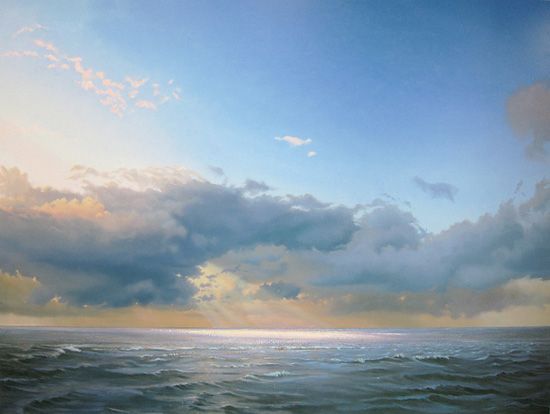 |
| Evening Clouds over the Ocean, oil on panel, 47.2" x 63" |
The below detail is part of the ocean, just left of the center. It's about 3.5" x 2.5". As you can see I painted a lot (a lot) of dots on top of a purple-ish ground layer. This is not according to the rules of the French Pointillists, who covered their entire painting with dots. The similarity is what is called 'optical mixing'. It means that, seen from a distance, your eyes mix the dots to a single color. The result is a vibrant surface. You'll never get this kind of surface when you mix the color on your pallet. I use it mostly when I paint the ocean to suggest the movement of the water at mid-distance. In my Painting Reflections tutorial you can see an example.

The realism of my work is for the greatest part the result of smooth transitions. Even in the above detail you can see I painted the dots on top of such a transition. The color of the sky is another example. From the left to the right it slowly changes from almost yellow to a dark blue. To achieve this I use a technique called stippling and a badger hair fan brush. In my Painting Clouds video I show how I do it.
Good post.
ReplyDeleteGlad you like it, Tony!
DeleteHello Sir
ReplyDeleteHope you're doing good!
I've both of these videos and I've enjoyed watching you use the 4 techniques that you mention in this as well as your previous blog to achieve subtle gradations in sky and impressions of sparkles and waves. I believe you mentioned sometime earlier the use of the right substrate or surface is of equal importance in achieving the photorealistic look. With that in mind, hope you can help with a few questions. Is it important to use only an oil primed ( as opposed to acrylic primed) hardboard panel and if so how many coats should it have ? When I use linen , I prime it myself but I find the process of priming multiple times really cumbersome and sometimes it leaves marks which is ok on linen but would be more visible on wooden panels . I was hoping to know your thoughts on this and wondering if there a ready to use product you can suggest?
Hi Asha, Thanks for your questions. I have always used acrylic primed panels. Back in the day, when I primed them myself, I used Gesso (a Talens brand). It's an acrylic primer, perfect for priming canvas as well as board. I wrote a short article about it on my 22 January 2015 blog(titled Canvas or board). Nowadays I order my panels at a Dutch firm (Muspaneel at http://www.panelsforartpainting.nl/en_GB/). You can order online. Or maybe get a sample...
DeleteHello Mr Dolsma.
ReplyDeleteI have also seen both videos, in the first one you left the space for the clouds blank and painted blue sky around it, but in the second video you painted the sky all blue first then painted white clouds over the blue, and it was not explained why. Also how smooth are your boards. I have bought ready primed boards and I had hard time making it grab the paint. one last question in the smooth transition in the sky how do you blend the yellow part of sky to blue part without getting green as result of yellow and blue mixing. Thanks. and still waiting for your sunset video.
Hi Nikki, I probably should've explained more extensive why I use a different method to paint the clouds in the reflections video. In the video I mention two reasons: the first is that it's easier to blend in the clouds, because the blue background always keeps shining through, even though it's hardly visible (day 1 of the video). The second reason I mention is the possibility of using a cloth to wipe out parts of the clouds (when they're still wet) to create an open outline (day 2).
DeleteIt's difficult for me to judge why your paint doesn't grab, because I don't know how your board is primed. My boards (6 mil MDF) are very smooth. You can order them online at http://www.panelsforartpainting.nl/en_GB/. If you want to prepare them yourself you could maybe read my blog entry 'Canvas or board'(January 22, 2015).
When you add yellow to the blue of your sky it's always going to get a little greenish. It all depends on the amount of yellow. My favorit is a little Naples yellow, mixed to kings blue. When you add titanium white to the mix, it softens the green hue even more.
Yeah, the sunset video... I'm not making any promises about that anymore. Been real busy with exhibitions and commissions, but I'll get to it asap!
Hello sir. What color you use for sands
ReplyDeleteThe basic color I use for sands is flesh color by Lukas, a German brand. If I want a neutral sand color I add some sepia and sometimes a little green earth. In the shadow parts I often add just a hint of purple. The best thing is probably to experiment and find your own color. Hope this helps!
Delete