Friday, July 21, 2017

Theory

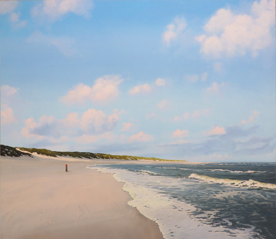
Probably every artist and certainly every gallery owner always wonders why one painting sells and another one doesn't. They're hoping to find some kind of secret rule that predicts success or failure. Quite useful in an unpredictable environment like the art business. Now take a look at the paintings below and in particular at the year in which I painted them.

Passage, oil on panel, 35.4 x 47.2", 2007

Shore Line, oil on panel, 15.7 x 19.7", 2011

Sunset with Storm Clouds, oil on paper, 11.8" x 15.7", 2016

The first painting is not exactly  a happy painting, with it's dark sky and the suggestion of bad weather. Now look at the date: 2007, one year before the economic crisis. Sales went through the roof and everybody was quite optimistic. The second painting was painted in the middle of the crisis (2011). A bright sunny painting, while the overall mood was pretty down. The third painting is again a rather dramatic, dark scene. The date is 2016. The crisis is over and our ideas about the future are much brighter than five years earlier.

My idea is that people only buy paintings with a dark mood when everything is fine and the mood is optimistic enough to stand a little drama. During the crisis people had enough trouble of their own and they weren't about to pay good money for more gloom & doom. No chance I would've sold a painting like the first one. Sunny works, like the second one, still sold, though  sales went down considerably. Now in 2017 the crisis is over and there is again room for paintings with a dark atmosphere.

Of course this is not an entirely new idea. During the crisis of the nineteen-thirties the great American  show movies with song and dance did very well. Probably the same mechanism. Maybe I should try my luck with a couple of heavy skies again...

Thursday, July 6, 2017

Indanthrene Blue

Sometimes I ask my wife (when she's going downtown to shop) to buy me some painting materials. She doesn't always stick to the list I give her. Or rather she brings home more than is on the list. That's how I started working with Transparent White for example. She's an accomplished painter herself and she knows what she's doing. This time I asked her to buy a few tubes of Ultramarine Blue, which she did, but on top of that she bought me Rembrandt Indanthrene Blue.


Now I don't know about you, but I never heard of Indanthrene Blue. It turns out to be a valuable addition to my palette (I told you, she knows what she's doing!). I hope the above picture gives you an idea, but I'm afraid the intensity of the color will get lost on the screen. It's a very deep and rather warm blue, a bit like Ultramarine, but darker.

Most blues loose color pretty quick when you add white and that's a problem when you need a very light sky that is still distinctly blue. Well, this one keeps it's color, even mixed with a considerable amount of Titanium White. I used it in the beach scene below. Just added a hint of Caribbean Blue (mostly in the lower part of the sky). I am really pleased with the result. This is probably not the last time I'll use Indanthrene Blue!


Rising Tide, oil on panel, 27.6 x 31.5"