

Friday, December 25, 2015
Thursday, December 10, 2015
Passe-partout
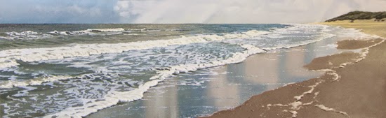
Some of you may know that every now and then I make an oil sketch on paper. Sometimes in preparation of the 'real thing', sometimes to convince a client to place the commission. I sell these sketches online for a modest price (http://www.janhendrikdolsma.nl/paintings/). When a work is sold I package it between two styrofoam sheets and send it to the buyer in a cardboard envelope. But before I do, I put it in an acid free passepartout.

I used to make them myself, but nowadays I got a frame maker and she (yes, it's a she) does it a hundred times better than I ever will. She makes me a so called 'travel passepartout' that protects the front- and backside of the painting. In combination with the cardboard envelope and the styrofoam sheets the work is properly protected. In the last couple of years I sent quite a few of these sketches and up to now they always arrived undamaged (knock on wood...).

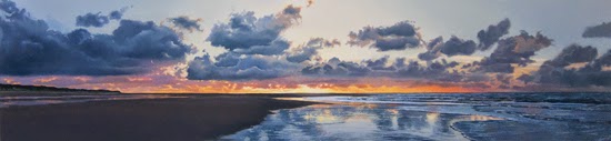
This particular sketch falls in the 'convincing the client' category. I was pleased when they ordered the 'real thing'. The sketch is now for sale on my website. Hope you like it.

I used to make them myself, but nowadays I got a frame maker and she (yes, it's a she) does it a hundred times better than I ever will. She makes me a so called 'travel passepartout' that protects the front- and backside of the painting. In combination with the cardboard envelope and the styrofoam sheets the work is properly protected. In the last couple of years I sent quite a few of these sketches and up to now they always arrived undamaged (knock on wood...).

This particular sketch falls in the 'convincing the client' category. I was pleased when they ordered the 'real thing'. The sketch is now for sale on my website. Hope you like it.
 |
| Windy Beach, 30 x 40 cm, oil on paper |
Thursday, November 26, 2015
Details #2
I had a good week. Sold two paintings. A small one over the internet and a big one in a gallery. Nice, with the holiday season coming up. Finished a commission and I'll hear about another one next week. And last but not least, I posted a new Youtube clip on how-to paint details. You might say I've been busy.
The clip is actually not my own idea. Somebody suggsested it in an email, after reading my blog post on painting details. Sadly I forgot his name (shame on me...) and I cant find the mail in my inbox. So, wherever you are: thanks! Hope you enjoy it.
The clip is actually not my own idea. Somebody suggsested it in an email, after reading my blog post on painting details. Sadly I forgot his name (shame on me...) and I cant find the mail in my inbox. So, wherever you are: thanks! Hope you enjoy it.
Thursday, November 12, 2015
Failing better
 I recently got an email that ended with the line "Happiness is a journey, not a destination". It's a poetic call to enjoy the ride instead of focussing on the destination. When you apply this assertion to painting you could say "It's the process that counts, not the result". Not very poetic, eh?
Apart from that, do I agree? Sure, I like the whole trial-and error thing, the process of expirimenting and learning, of hope and frustration. If you hate that, you're probably better off in a different occupation. But to be honest, without an occasional result I would have given up long ago. Nothing beats the excitement of the feeling that you're on the right way and the satisfaction when you made something worth while. The process is no fun at all without the result. The promise of a result lights up the process. Poetic, eh?

Maybe you heard of Stan Wawrinka, the Swiss tennis player who always came in second. Only recently he started winning titles. On his arm he has a tattoo with a line from a Samuel Becket poem: "Ever tried. Ever failed. No matter. Try again. Fail again. Fail better." My kind of guy.
The painting on the right side was made in a period of four years, starting in 2008. The size is 90 x 90 cm, oil on canvas. I was never really satisfied with the result and I kept changing it. For you to judge if I failed better...
Wednesday, October 28, 2015
Commissions, yes or no?
 |
| Dunes with Tulip Fields, oils on paper, sketch, 30 x 40 cm |
 |
| Detail of the sketch |
In the second strategy I let the buyers (it's very often a couple) in on the process. To do so, I must first get a clear idea of their wishes. Next I make an oil sketch on paper and mail them a picture. I will incorporate their comments and after their consent I make the painting in oils on panel. When it's done, they're
obliged to buy it.
 |
| Tulip Fields, finished, oils on panel, 50 x 70 cm |
When you compare the sketch and
the painting on panel, you may not
see a lot of difference and on your
computer screen that's true. That's
why I added details of both the sketch
and the finished painting.
 |
| Detail of the finished painting |
Saturday, October 17, 2015
Details
My work looks pretty detailed, when viewed on a computer screen. In reality it's not as detailed as you'd think. In reality I don't paint every tiny wave. To be honest I'm not that patient. I try to find a 'handwriting' (by lack of a better word) that suggests detail rather than actually depicting it.
Let me give you an example. The painting below is a big one (120 x 160 cm). I added the black boxes to indicate the position of the details. As you can see it's a mess of dots and specs on a rather dark background.
For more details, please go to the 'recent work' section of my web site (www.paintingskies.com). Just below each work is a 'detail' box,that zooms in on the painting.
Let me give you an example. The painting below is a big one (120 x 160 cm). I added the black boxes to indicate the position of the details. As you can see it's a mess of dots and specs on a rather dark background.
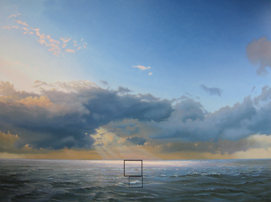 |
| Ocean with Evening Clouds, oil on panel, 120 x 160 cm |
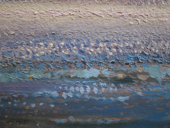 |
| Upper box |
 |
| Lower box |
For more details, please go to the 'recent work' section of my web site (www.paintingskies.com). Just below each work is a 'detail' box,that zooms in on the painting.
Thursday, October 1, 2015
Online sale
I just returned from a short vacation on one of the Dutch Wadden Sea islands. Fantastic clouds and the occasional shower, my favorite kind of weather. I came home with a load of inspirational pictures. The downside is, I didn't have a lot of time to write an article for this blog.
In my previous blog entry I told you about the oil sketches on paper I've been working on. The sunset painting below is an example. I posted some of these sketches on my online sale page. If you're interested, please go to http://www.janhendrikdolsma.nl/paintings/.
 |
| Sunset with Landwash, oil sketch on paper, 30 x 40 cm |
The response to the free 20 minutes tutorial was great. By the way, the offer still stands. Please send an email to info@janhendrikdolsma.nl and I'll mail you a link to the tutorial. In the September 16 blog you'll find a link to the Youtube trailer.
Thanks!
Wednesday, September 16, 2015
Free Painting Sunsets tutorial
"Sunsets are simply amazing. Every single one is different. I tried my hand at painting them quite a few times, even though, according to the Art Police, sunsets are kitsch. But who cares, I love kitsch..."
I'm thinking about making a sunset tutorial, sometime next year. In preparation I'm working on a series of oil sketches on paper. I filmed the painting process of one of these sketches with my new compact camera (I confess, I'm a gadget freak...) and boiled it down to a short 20 minutes tutorial. The 2 minutes trailer is now on YouTube. If you're interested in the free 20 minutes version, please send an email to info@janhendrikdolsma.nl. Of course you'll then have to put up with my Newsletter every two months...
Thursday, September 3, 2015
Economics
 | ||
| Small Wave, oil on panel, 45 x 15 cm |
I read that only 5% of the artists with a professional training can actually make a living selling their art. The remaining 95% have spouses with a job, or have a job themselves. That was my situation for quite a few years. I had a teaching job for three days a week. It wasn't until 2004 that I quit and started making a living as an artist. Great day for me. I loved teaching, but being my own man, making my own decisions is the best thing that ever happened to me. I still enjoy that freedom every day. But it comes with a cost: an unsteady income. If you want financial stability, you better find a different occupation.
I kept my head above water, during the economic crisis. The internet has been a great help. It enabled me to sell my work online (mostly oil sketches). Selling my tutorials would have been impossible without the internet.
Did the crisis affect my artistic decisions? Sure. I made far more small paintings, even when my heart went out to the larger formats. Gotta make a living...
The good news is that I had a great year so far. Sales are picking up, for the large formats in particular. Got some inspiring ideas for new paintings. I'll keep you posted.
Thursday, August 20, 2015
Ugly underpainting
My underpaintings sometimes are plain ugly. Some of you may have had this experience. You start working on a painting and when the first layer is done, you look at the thing and you think: this is never going to work. I'm the worst painter ever. The colors are pale, the surfaces not as smooth as you want them to be and the transitions are off.
Through the years I found out that it's hard to avoid this. Especially with the layering technique I use. Here's an example:
Through the years I found out that it's hard to avoid this. Especially with the layering technique I use. Here's an example:
 |
| Sunset, 50 x 150 cm, oil on panel, underpainting |
Not very promising, huh?
In the following layers I slowly built up the colors to the level of saturation I wanted. Because I use quite a lot of medium it took a few layers to get there. This is how it turned out:
 |
| Sunset, 50 x 150 cm, oil on panel, finished state |
Check out my website for a bigger picture: http://www.paintingskies.com/products/
As you can see the initial color of the sea in the underpainting was quite dark. I added the lighter accents in the next layers. This sometimes works better than the other way around.
 |
| Sunset, detail |
Anyway, if you sometimes get the feeling that there's a wide gap between what you had in mind and the present state of your painting, remember that's how it's supposed to be. Just keep going and somewhere along the line things will take a turn for the better.
Thursday, August 6, 2015
Working on a finished painting
Been working on a finished painting. I do that quite often. I convince myself that a painting is finished, but after some time (a few weeks, months, even a year) it turns out that's not the case at all.
This particular painting had been in an exhibition for six weeks and the moment the exhibition was over I picked it up at the gallery and reworked it. Now it's finished. I mean really finished. I even gave it a new title. Period.
Here are the two stages. The one at the bottom is the way it looks at the moment. The definitive, final, not-to-be-touchedd-again stage. Did it get any better? What do you think? Let me know!
If you want to take a closer look, please check my web site (http://www.paintingskies.com/products/)
 |
| Wide Beach, oil on panel, 50 x 150 cm |
 |
| Narrow Beach, oil on panel, 50 x 150 cm |
Thursday, July 23, 2015
Painting side effects
I love being a painter. For several reasons. The most important of course being painting itself. Nothing compares to working for hours, struggling to get it right, and at some point look at your painting from a distance and think: "Hey, now we're getting somewhere!".
Last fall we met at the Rijks Museum in Amsterdam. He's 71 now, but that doesn't keep him from travelling Europe. We spent the day looking at great art, talking about the price of gas and about our favorite paintings.
Robert Hobkirk is a bit of a Renaissance-man. Not only is he the author of a great art blog, but he’s also the sculptor of wonderful objects made from stuff other people throw away. Not only does he write short stories that are both funny and sad, he’s also an amazing poet, who recently published his first book: Haiku Avenue, 333 haiku poems.

Though the classical Japanese haiku style is pretty old, Hobkirks poems are as fresh and alive as can be. The subject matter ranges from sensitive nature observations to steaks sizzling in a frying pan. I just love every one of the 333. Here's one:
 |
| The Last Quarter, oil on panel, 80 x 60 cm |
Another reason is the fact that I get in touch with people from all over the globe. They share one thing: their love of painting. Every now and then I get to meet one of them in person. Like Robert Hobkirk, for example. He's an amazing guy. Lives in Northern California with his loving wife Jeannine and their dogs Belle and Molly. A few years ago he wrote me an email about my work and that was the start of an ongoing correspondence.
Last fall we met at the Rijks Museum in Amsterdam. He's 71 now, but that doesn't keep him from travelling Europe. We spent the day looking at great art, talking about the price of gas and about our favorite paintings.
Robert Hobkirk is a bit of a Renaissance-man. Not only is he the author of a great art blog, but he’s also the sculptor of wonderful objects made from stuff other people throw away. Not only does he write short stories that are both funny and sad, he’s also an amazing poet, who recently published his first book: Haiku Avenue, 333 haiku poems.
Though the classical Japanese haiku style is pretty old, Hobkirks poems are as fresh and alive as can be. The subject matter ranges from sensitive nature observations to steaks sizzling in a frying pan. I just love every one of the 333. Here's one:
Hard rain after dark
we slept in a driftwood hut
ocean snored all night
Even more recently he came out with a second book: Somewhere Poetry Grows Wilde Under the Eucalyptus. In the fall he hopes to publish some short stories and a novel is scheduled for next year. Just can't wait...
Thursday, July 9, 2015
Photographing your work
Some five weeks ago I bought a new compact camera. Not that the one I had was broken or anything, but I wasn't satisfied with the video quality. The new camera is absolutely amazing. HD video quality and fantastic stabilizing.
It also has a time lapse mode. That was new to me, so I had to figure out how it worked. I had planned to make an oil sketch for a possible commission (which I didn't get...) and I thought it might be a good idea to film the making-of as a time lapse. Great fun to see myself as a Comedy Capers character working like mad on this little painting. Hope you enjoy it too.
It also has a time lapse mode. That was new to me, so I had to figure out how it worked. I had planned to make an oil sketch for a possible commission (which I didn't get...) and I thought it might be a good idea to film the making-of as a time lapse. Great fun to see myself as a Comedy Capers character working like mad on this little painting. Hope you enjoy it too.
Now let's get serious: taking pictures of your work can be quite frustrating. The colors are off, the image is unsharp, annoying reflections, what have you. There are a few simple groundrules that can make your life easier, at least when it comes to taking pictures of your work.
Here we go:
- The quality of the light is the most important factor. Bad lighting, bad picture. The best light can be found on an overcast day with diffuse light. Take your painting outside and you'll be amazed by the quality of the pictures.
- When you shoot indoors, make sure you use daylight lamps. Most everyday light bulbs are way to yellow.
- No direct flash. Direct flash equals reflections.
- Use a tripod. A stabilized camera allows you to use a wider diafragm and higher shutterspeed. Which leads to sharper pictures.
- Treat yourself to a photo software program. It will allow you to adjust not only lightness and contrast, but color hue as well. I use Photoshop Elements. It has all the features I need and is relatively cheap. Indispensable for fine tuning your pictures.
Success!
 |
| Changing Weather, oil on panel, 15 x 45 cm |
Thursday, June 25, 2015
Painting Questions
Got an email with a number of painting questions from David Barclay. David is a great still life painter. His paintings of musical instruments are really impressive. If you're interested: http://davidbarclayart.com/
Most of his work is in acrylics, but lately he started working in oils. He kindly gave me permission to quote some of his questions.
1. "What would you recommend regarding the series of the oil paints that I purchase? I have no sense of how much difference there is between a series 1 and a top of the line series 8, so this is a real puzzle to me. My guess is that it makes more of a difference for some colors than others, but don't know. What improves as you go up the series "ladder?"
Problem is that manufacturers have different ways of dividing their paints. The only one I know that works with 'series' is Royal Talens with their Rembrandt line. Series 1 are the whites, series 2 the yellows and so on. In this case it's not a matter of the higher the number the better the quality. My advice is to buy the earth colors, the flesh colors and the greens from a cheaper brand like for example Lukas. Their Lukas 1862 brand has an excellent price-quality rate. When you get to the warm colors it pays off to buy a more expensive brand, like Old Hollandt. Their paints are packed with pigment.
2. From watching the videos, it appears to me that when you use W&N Liquin Original, your paintings dry overnight so that they can be worked on again the next day. Is that right?
Yes. I used to work with traditional media. They took ages to dry. I was forced to work on two or three paintings at a time. Now I can continue working the same painting the next day. Much better.
3. "In your first video you used Liquin Original and in the second Liquin Light Gel. Did I understand that you have basically switched to the Gel, or do you use them in different situations? Why?"
Yes, I switched to the gel. For me it works better in getting smooth surfaces, especially with large paintings. I also like the gel better when it comes to glazing. The price is the same. You have to store it in the dark. It hardens under the influence of light.
4. "Do you use alkyd oil paints? Why or why not?
Yes, I have used alkyds. I found it harder to get the smooth transitions I want. Plus they smell funny... But that's personal. I know people who prefer alkyds over oils. One of the advantages is that you can apply a finishing varnish after a few monthts, where as with oils you'll have to wait at least a year.
5. "I noticed as I looked at some suppliers listings of oil paints that
there are toxicity ratings that the state of California requires be
listed for certain colors. I could not help but think of your frequent
use of your thumb. Do you do anything to minimize this possible
danger? I would say that I am not an extremist on this front, but would
prefer to err on the the side of safety. (Our joke here is that there
are certain chemicals that only cause cancer in California. A bit of
black humor!)"
Since the days my dad worked as a house painter, health hazards have been greatly diminished. Legislation in Europe as well as in the USA and other countries has become much stricter. It never entered my mind that my thumb technique could be a health hazard. Been doing it for over twenty years. I often wash my hands after using my thumb, but that's because my brushes get slippery if I don't.
So much for the Q and A. If you have questions like this, please feel free to ask them. On this blog or through my email: info@janhendrikdolsma.nl.
Most of his work is in acrylics, but lately he started working in oils. He kindly gave me permission to quote some of his questions.
1. "What would you recommend regarding the series of the oil paints that I purchase? I have no sense of how much difference there is between a series 1 and a top of the line series 8, so this is a real puzzle to me. My guess is that it makes more of a difference for some colors than others, but don't know. What improves as you go up the series "ladder?"
Problem is that manufacturers have different ways of dividing their paints. The only one I know that works with 'series' is Royal Talens with their Rembrandt line. Series 1 are the whites, series 2 the yellows and so on. In this case it's not a matter of the higher the number the better the quality. My advice is to buy the earth colors, the flesh colors and the greens from a cheaper brand like for example Lukas. Their Lukas 1862 brand has an excellent price-quality rate. When you get to the warm colors it pays off to buy a more expensive brand, like Old Hollandt. Their paints are packed with pigment.
 |
| Reflections #2, oil on panel, 50 x 150 cm |
2. From watching the videos, it appears to me that when you use W&N Liquin Original, your paintings dry overnight so that they can be worked on again the next day. Is that right?
Yes. I used to work with traditional media. They took ages to dry. I was forced to work on two or three paintings at a time. Now I can continue working the same painting the next day. Much better.
3. "In your first video you used Liquin Original and in the second Liquin Light Gel. Did I understand that you have basically switched to the Gel, or do you use them in different situations? Why?"
Yes, I switched to the gel. For me it works better in getting smooth surfaces, especially with large paintings. I also like the gel better when it comes to glazing. The price is the same. You have to store it in the dark. It hardens under the influence of light.
4. "Do you use alkyd oil paints? Why or why not?
Yes, I have used alkyds. I found it harder to get the smooth transitions I want. Plus they smell funny... But that's personal. I know people who prefer alkyds over oils. One of the advantages is that you can apply a finishing varnish after a few monthts, where as with oils you'll have to wait at least a year.
 |
| Evening Breakers, oil on panel, 15 x 40 cm |
Since the days my dad worked as a house painter, health hazards have been greatly diminished. Legislation in Europe as well as in the USA and other countries has become much stricter. It never entered my mind that my thumb technique could be a health hazard. Been doing it for over twenty years. I often wash my hands after using my thumb, but that's because my brushes get slippery if I don't.
So much for the Q and A. If you have questions like this, please feel free to ask them. On this blog or through my email: info@janhendrikdolsma.nl.
Thursday, June 11, 2015
About brushes
Got an email from my good friend Marc, with a few questions about my tutorial videos. He kindly gave permission to quote him.
"It seems to me that when you are doing your first layer of both sky and sea, you could be getting it done a lot quicker if you used a larger brush with big strokes. Instead you used a very small brush making little strokes coming from many directions QUESTION: Why?"
I use a small brush to get more control over the transition from light to dark. It enables me to take small steps, slowly changing the color from light to dark. It makes the transition more gradual.
"It seems to me that you could blend all your colors together without the need for stippling. QUESTION: Why all the stippling?"
The stippler is important to make the transitions as smooth as possible. Every time you add a slightly darker color you'll get a visible edge between the two shades. These edges are blurred by using the stippler. When you skip the stippler, and only use the badger hair fan brush, you'll get good results as well. With the stippler you'll get great results.
Do you have questions like this? I'd be happy to answer them if I can. Or you could download one of my tutorial video's at www.paintingskies.com/video
 |
| Lyon brush/stippler |
I use a small brush to get more control over the transition from light to dark. It enables me to take small steps, slowly changing the color from light to dark. It makes the transition more gradual.
"It seems to me that you could blend all your colors together without the need for stippling. QUESTION: Why all the stippling?"
The stippler is important to make the transitions as smooth as possible. Every time you add a slightly darker color you'll get a visible edge between the two shades. These edges are blurred by using the stippler. When you skip the stippler, and only use the badger hair fan brush, you'll get good results as well. With the stippler you'll get great results.
Do you have questions like this? I'd be happy to answer them if I can. Or you could download one of my tutorial video's at www.paintingskies.com/video
Thursday, May 28, 2015
Solo show at 'De Twee Pauwen' Art Gallery
Last Sunday was an exciting day for me. My fifth solo show at 'De Twee Pauwen' Art Gallery opened. De Twee Pauwen (The Two Peacocks) is a beautiful gallery in Den Haag center, close to the Royal Palace. The weather was great, lots of sunshine, hardly any wind. No gallery-weather at all. Gallery owners like a clouded sky and wind.
Anyway, despite the beautiful weather, the turnout wasn't bad at all, the music and the sales were great and I had a really good time. I've been working my boots off these last few months and this was my reward. Check the recent work section of my website for an overview of the exhibition.
Here's a short impression of the event.
Friday, May 15, 2015
Reflections video online
In the last few months I kept you posted on the new video we were working on. We started back in January and now it's finished and available at www.paintingskies.com/video.. Can't help but to feel a little proud...
Step by step I take the viewer through the painting process, from a blank panel to the finished work. The subject this time is painting reflections. To quote myself: "Painting reflections isn't exactly easy but it's no rocket science either. You just have to observe a few ground rules."
Every now and then the video wanders off to images of the island that has been the inspiration for many of my paintings, the Wadden Sea island Vlieland. It has been of great importance to my life and my work, going back to the drawings I made there as a five year old.
Here's the YouTube trailer. Let me know what you're thinking!
My dear friend Theo van Egeraat shot the video, just like he did the previous one. Beautiful footage, with a sharp eye for the painting process.
The music was composed by Udo Pannekeet, one of the best contempory Dutch bass players. His music, with the warm sound of his fretless bass, takes the video to another level.
The finished painting will be part of my solo at De Twee Pauwen Art Gallery in The Hague (Netherlands) from May 24 - July 7, 2015.
Friday, May 1, 2015
Varnishing-day
Been working hard for my solo show next month in The Hague (Netherlands). Beautiful gallery in the old center, close to the Royal Palace. Projects like this are very inspiring. The final painting is almost ready and now it's time for the stuff that I don't like. Varnishing for example.
I carefully read the weather forecast when planning 'Varnishing-day'. Temperatures have to be mild (and that can be a problem during Dutch spring), little wind, no rain. When the day arrives I open all the doors and windows, take a deep breath and go for it, hoping the draft will chase the fumes. In the past I sometimes wore a face mask, but I had trouble breathing, wearing it.
There is an infinite number of varnishes on the market today, but basically, there are two kinds for oil paint: retouching varnish and finishing varnish. You got to wait at least a year before applying a finishing varnish (oil paint takes forever to dry), so most of my paintings leave the studio with just a layer of retouching varnish. No problem.
Retouching varnish comes as a glossy varnish only, and I don't want the surface of my paintings to shine like a mirror, so I add terpentine or white spirit, up to 30%. I use a broad hog hair varnishing brush and a small paint roller to add a fine texture to the the surface.
Once the job is done, I quickly forget the smell and the fumes. Colors are intensified and I like the satin gloss. But the best moment is yet to come, when I enter the gallery and see the work in the great setting of De Twee Pauwen Art Gallery. From May 24 - July 7.
Want to see more of the work I did for this exhibition? Check www.paintingskies.com.
I carefully read the weather forecast when planning 'Varnishing-day'. Temperatures have to be mild (and that can be a problem during Dutch spring), little wind, no rain. When the day arrives I open all the doors and windows, take a deep breath and go for it, hoping the draft will chase the fumes. In the past I sometimes wore a face mask, but I had trouble breathing, wearing it.
 |
| Beach with Tyre Tracks, oil on panel, 50 x 150 cm |
There is an infinite number of varnishes on the market today, but basically, there are two kinds for oil paint: retouching varnish and finishing varnish. You got to wait at least a year before applying a finishing varnish (oil paint takes forever to dry), so most of my paintings leave the studio with just a layer of retouching varnish. No problem.
Retouching varnish comes as a glossy varnish only, and I don't want the surface of my paintings to shine like a mirror, so I add terpentine or white spirit, up to 30%. I use a broad hog hair varnishing brush and a small paint roller to add a fine texture to the the surface.
 |
| Windy Beach (excision), oil on panel, 90 x 120 cm |
Once the job is done, I quickly forget the smell and the fumes. Colors are intensified and I like the satin gloss. But the best moment is yet to come, when I enter the gallery and see the work in the great setting of De Twee Pauwen Art Gallery. From May 24 - July 7.
Want to see more of the work I did for this exhibition? Check www.paintingskies.com.
Thursday, April 16, 2015
Reflections, the video #2
In my February 5 blog entry I wrote about the new long video we were shooting. Well, the painting is finished and we did a first edit. Next step is the voice over and of course the background music.
I hope it'll be online sometime in May. Here's the painting.
That's all for now. Busy. More in two weeks!
I hope it'll be online sometime in May. Here's the painting.
 |
| Reflections, 120 x 90 cm, oil on panel |
Thursday, April 2, 2015
How to get a gallery
After I finished my studies at Minerva Academy, sometime in the early seventies, I sort of gave up painting. I wanted to make music and that's what I did. I even quit my teaching job to be a full time musician. But when the band I played in hadn't made it to world fame after a few years, it split up and I went back to teaching.
It wasn't till 1996 that I started painting again. Felt a sudden and deep urge to pick up my brushes and I didn't put them down ever since. After some time I wanted to show the world what I made, so I started looking for galleries. The internet was not yet in full swing, so I wrote letters with one or two pictures of my work. If I was lucky I got a rejection letter, but very often not even that. Sometimes (if I felt confident enough) I picked up the phone to make an appointment with a gallery owner to show my work. I made quite a few miles with paintings in the trunk of my crappy car. Every now and then I got lucky and after a few years my work started selling. In 2004 I quit my teaching job for the second time and I've made a living doing what I love best since then. Feel really blessed.
Trying to get a gallery to show your work is one of the more unpleasant aspects of a painter's life. Still you have to put in the hours, again and again. Here are a few tips that may help:
- Before you get in touch with a gallery do some research. Find out about their artists and how you fit in, or more precise, what your work will add to the gallery. 'What's in it for me' is a common question for a lot of people and gallery owners are just like people. They want to know what your work will add to their business.
- Never barge in on a gallery owner unannounced. They hate that, they feel ambushed and your chances are reduced to practically zero.
- Try to think of a strategy. I often sent an email to a gallery, announcing that I would send them a book on my work. This gave me a reason to contact them again, had the book arrived? Have a number of questions prepared. When you got a conversation going, your chances are growing.
- Don't overdo it. It's frustrating work and you got to spread your frustration thin. Painting is to much fun to let it be ruined by gallery rejections.
If you have a story to share about your search for galleries, please let me know!
It wasn't till 1996 that I started painting again. Felt a sudden and deep urge to pick up my brushes and I didn't put them down ever since. After some time I wanted to show the world what I made, so I started looking for galleries. The internet was not yet in full swing, so I wrote letters with one or two pictures of my work. If I was lucky I got a rejection letter, but very often not even that. Sometimes (if I felt confident enough) I picked up the phone to make an appointment with a gallery owner to show my work. I made quite a few miles with paintings in the trunk of my crappy car. Every now and then I got lucky and after a few years my work started selling. In 2004 I quit my teaching job for the second time and I've made a living doing what I love best since then. Feel really blessed.
 |
| Beach poles, oil on panel, 70 x 100 cm |
Trying to get a gallery to show your work is one of the more unpleasant aspects of a painter's life. Still you have to put in the hours, again and again. Here are a few tips that may help:
- Before you get in touch with a gallery do some research. Find out about their artists and how you fit in, or more precise, what your work will add to the gallery. 'What's in it for me' is a common question for a lot of people and gallery owners are just like people. They want to know what your work will add to their business.
- Never barge in on a gallery owner unannounced. They hate that, they feel ambushed and your chances are reduced to practically zero.
- Try to think of a strategy. I often sent an email to a gallery, announcing that I would send them a book on my work. This gave me a reason to contact them again, had the book arrived? Have a number of questions prepared. When you got a conversation going, your chances are growing.
- Don't overdo it. It's frustrating work and you got to spread your frustration thin. Painting is to much fun to let it be ruined by gallery rejections.
If you have a story to share about your search for galleries, please let me know!
Thursday, March 19, 2015
Perfect?
Got an email from Christian from Germany. He saw my Painting Clouds video and wrote some nice things about it. I can never get enough of that. Very encouraging.
In the correspondence that followed the topic was perfectionism and how it can hold you back. Christian wrote:"..my inner critic slows me down or prevents me from doing anything at all". Attached to his mail he sent me a cloud painting he made. Looked real good...
Ofcourse it's a good thing to set the bar just a bit higher every time you start a new painting, to set goals and all that kind of stuff. But however much you grow, you'll never be perfect. And that's a good thing. One of the joys of painting is the feeling you're getting better, that over time you've learned to master problems you couldn't handle before. If you could be perfect, you would loose that. Boring.
At the end of a work day I often ask myself: did my painting get better today? Most of the time the answer is yes. If I'd ask myself: did it get perfect today, the answer certainly would be no. You gotta ask the right questions.
Painting is an excellent way to get in a state of flow. For a few hours there's just you and the painting. In 1975 a guy with a funny name (Mihaly Csiksgentmihalyi) wrote a great book about it, called 'Flow'. One of the conditions to enter a state of flow, he writes, is that the task ahead of you may be difficult, but you feel you can do it. In other words: match your challenges to your skills. And do the hours, I'd like to add.
I just finished this sunset. Succeeded to paint the movement of the water, with the little ripples and everything, on top of a ground layer. Tried it before but it didn't really work. I didn't match my challenges to my skills, I guess...
 |
| Sunset, oil on panel, 50 x 150 cm |
Friday, March 6, 2015
Grisaille
Some of the painting techniques I use have a long history. Glazing for example (where you paint transparent layers on top of each other) dates back to the 15th century. In my Painting Clouds video I explain what it meant to me when I first learned about it.
Another technique I sometimes use is the 'grisaille'. The French word 'gris' means grey and that kind of sums it up. The painter limits his palet to black, white and grey. A lot of 15th century triptych doors have a grisaille of a saint at the back. In the 16th century it was Leonardo da Vinci, I think, who was the first to use the grisaille as an underpainting.
 By doing so he was able to tackle the problems of volume and composition, without having to bother about color. In combination with glazing (to apply your colors) it's a really powerful tool. It gives you maximum control, because you build up your painting step by step. It takes a lot of planning and patience though. If you're the 'I-have-to-spontaneously-express-my-feelings' kind of painter this is probably not the right technique for you.
  In my painting After the Storm I was very keen on getting the structure of the sand right, so I painted it in detail with black and white acrylics. Then I slowly built up my colors with oils. Even though the black and white structure almost disappeared in some areas, you can still see it shimmering through the top layers. On your computer screen there's probably not a lot left. That's what happens when a painting of 90 x 120 cm has to fit on a laptop screen...
Anyone tried this? Let me know!
Thursday, February 19, 2015
Horizons
 |
| Beach with Tyre Tracks, oil on panel, 150 x 50 cm |
 |
| Sunset, oil on panel, 150 x 35 cm |
In the meantime work on the new video is steadily progressing. We got a new HD camera. Amazing quality. Can't wait to present the footage. Have to be patient though. It'll take at least a couple of months before it's ready. What I can show you though is a clip that'll probably be in the video. It's on the subject of color mixing, especially about how to mix colored greys. Fairly technical, but if you're into painting it might be interesting. Don't hesitate to contact me if you have a question!
Thursday, February 5, 2015
Reflections, the video
A few weeks ago we started shooting the second long play video after 'Painting Clouds'. Don't know when it will be released, but it will take a few months. Awful lot of work. The title will be 'Reflections'.
The video will show me working on a 120 x 90 cm painting of a beach with clouds reflecting in the wet sand. Last year I made an oil sketch of the subject and I was curious what it would be like on a large panel. Some of you may remember I wrote about it in 2014 in my 9 Oct post.
I found some really funny drawings I made as a five year old. I'll show a few of them in the video. I can clearly remember the moment I drew them. How hard it was to get them right and how dissatisfied I was with the results. Some things never change... Here's one to give you an idea.
Painting with a camera in your neck is a strange experience. At first I was aware of every move I made, but I'm slowly getting used to it. The camera man is a close friend, who also shot the Painting Clouds video. He knows how I work, so there are very few interruptions in the painting process.
Of course there is always a possibility the painting goes horribly wrong and we'll have to start all over again. That would make an interesting video: 'How not to paint reflections'. We'll see.
I'll keep you posted!
The video will show me working on a 120 x 90 cm painting of a beach with clouds reflecting in the wet sand. Last year I made an oil sketch of the subject and I was curious what it would be like on a large panel. Some of you may remember I wrote about it in 2014 in my 9 Oct post.
 |
| Oil sketch, 40 x 30 cm |
The title also refers to short intermezzi in which I will reflect on what inspires me, much like the latest video I posted on YouTube.
 |
| Shells, ball point, 1956 |
Of course there is always a possibility the painting goes horribly wrong and we'll have to start all over again. That would make an interesting video: 'How not to paint reflections'. We'll see.
I'll keep you posted!
Thursday, January 22, 2015
Canvas or board?
 Got several emails with questions about the surface I paint on. The short answer is: 6 mil. MDF panel, mounted on a wooden frame to prevent curvature.
 The long answer is: I used to paint on canvas, but the texture of the fabric started to bother me. I wanted the decision to be up to me, wether I needed a smooth or a textured surface. So I started painting on wood. I used to prepare my own (masonite) panels. Grounded them with Gesso (a Talens brand) and a brush. Watered the Gesso down in the first three, maybe four layers. Less water in each following layer and you avoid "gumming-up". I used very fine sandpaper to smoothen each layer, always with lots of water. To speed up the drying process I had a hair dryer on stand by. To tell you the truth: I hated it, it was an awful lot of work. The results were great though.
 Now I don't ground my own panels anymore. I found a guy here in Holland who does a great job preparing MDF panels. Smooth surface like you've never seen. At first it was hard, painting on his panels. Very slippery, made me feel uneasy. But over time I found a technique based on layering that allowed me to do just the stuff I had in mind.
I did a 70 minutes video (Painting Clouds by Layering) that tells the whole story. Here's the trailer.
Thursday, January 8, 2015
Photographs
A positive comment I often get is "Your paintings look just like photographs'. A negative comment I often get is "Your paintings look just like photographs'. Same phrase, opposite meaning.
Painters have always used the technical possibilities of their time to make their work look as real as possible. The 17th century Dutch painter Vermeer used an ingenious lense system and the 19th century Impressionists were keen to use the newly invented camera. In the 21st century painters use digital cameras and computers. A few years back I made a YouTube clip called 'The computer is a painter's best friend'. It's a small demonstration of how I use Photoshop to design my paintings.
Seen from a distance my work may seem photographic, but when you look up close, you'll of course see that it's not. That's why on my website (at least in the 'recent work' section) I always include two or more details when I put a paintng online. Sometimes these details become almost abstract. Dots of paint and small brush strokes that you don't see from a distance, let alone on a computer screen.
Got an email a while ago from a guy who just saw one of my paintings: "This was only a painting, but it made me feel
the same way as I had just done on the beach" This is a great compliment and it sums up what I'm after: make a painting that mirrors the feelings I have when I'm in this landscape, wether it's standing in awe for the grandeur of nature or simply enjoying the beauty of it all. For me realism is the way to achieve this, or at least get as close as possible. Mission impossible ofcourse, but I just love to keep trying!
 |
| Ocean with Evening Clouds, detail |
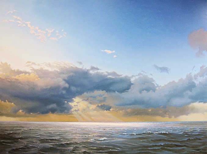 |
| Ocean with Evening Clouds, oil on panel, 120 x 160 cm |
Subscribe to:
Posts (Atom)