Thursday, December 21, 2017

Painting Snow

A White Christmas is very rare in Holland. I don't even remember the last time, but the web doesn't forget, so I looked it up: the last time we had one was in 2010 and the one before that was way back in the twentieth century. We do have snow though, at least a few times every winter. Very inspiring for a landscape painter.

There's a common misunderstanding about snow. I hate to break the news to you, but it's not white. It has a lot of different colors, ranging from yellowish to light shades of purple, depending on the circumstances, but not white.

Snowy Polder, oil on panel, 7.1 x 11.8"


For example: in a snow landscape it gets very clear that shadows have a distinct color. Not just some darker muddy shade, but an actual color. In the above landscape the shadows have a soft purple haze, that contrasts with the warmer sunlit parts. Painting a snow landscape is an excellent opportunity to practice your colored greys. If you want to find out more about mixing colored greys, you could watch the YouTube clip I did on the subject.

Snowy Dune, oil on panel, 27.6 x 39.4"

Snow landscapes often hinge on the contrast between warm and cold colors. A few warm accents in a predominantly cold painting often make a big difference. In the Snowy Dune painting the bottom part of the sky and the dune grass (detail below) do the trick. If you want to be sure of the warm-cold contrast you could try painting your snow landscape on a mars red ground. You'll be surprised!

Snowy Dune, detail

Thursday, December 7, 2017

A quick guide to painting oil sketches on paper

It's been quite a while since I last posted a clip on YouTube, it was January 2017 I believe. It's not that I don't enjoy making them, but painting comes first and I've been pretty busy this past year. Anyway, I did another one and you can watch it on YouTube. It's 'A Quick Guide to making Oil Sketches on Paper' of just over 6 minutes. Hope you enjoy it!


Thursday, November 23, 2017

Foam on the Beach

I've had better weeks. Felt a little weak on Monday, had a sore throat on Tuesday and was sneezing my head off on Wednesday. Couldn't paint all week. On top of that I managed to loose half of the footage for a video I was editing. Like I said I've had better weeks.

It once again made me realize how important painting is to me. So let's talk about a painting I did recently.

Foam on the Beach, oils on panel, 27.6 x 47.2"

Sometimes, when painting a film of water on a beach, I first do the beach, all the way up to the surf. In the early stages there's sand as far as the first breakers. The basic color here is a flesh tint with a little Sepia and Burnt Sienna. Closer to  the viewer there's evermore Sepia and Sienna.

On top of the beach I then paint this layer of water with it's reflections in thin glazes. I really love how the beach subtly shines  through in the color of the water. That's the beauty of glazing: it mimicks reality. First sand, then water. I've used this principle more often, for example when painting thin clouds over a blue sky. Though there have to be more examples I can't think of them at the moment. Gotta sneeze...

Thursday, November 2, 2017

Edgy

I always try to make my paintings as realistic as possible, even thought the scenes I paint are often imagined. When you're aiming for a high degree of realism a few things are essential. Smooth transitions for example. Equally important is the way you handle your edges. (By the way: the painting below is not the same as the one in my previous entry. It's a much larger variation on the same theme.)

Rain Clouds #2, oil on panel, 40 x 160 cm

Anyway, a cloud almost never has sharp edges. I already mentioned it in both my tutorial videos: a cloud with sharp edges is going to look like it's cut out and glued to the sky, instead of being a part of it. The way to paint a cloud that hovers over the earth's surface is by softening its edges. The lightest part is not on the edge.The cloud kind of slides into the background.


Rain Clouds #2, detail

Duhuh, mr. expert painter. Of course clouds have soft edges. They're fluffy, constantly changing phenomena. It's not hard to understand they have soft edges. But how about solid objects, like the pole in the painting below?


Snowy Dyke, oil on panel, 50 x 65 cm


Snowy Dyke, detail

I rest my case. Later!


Sunday, October 15, 2017

The importance of framing

Every now and then I get the chance to show my work in Belgium, one of our neighbor countries. Great people. They like (and sometimes buy) my work and that makes me very happy. But lately I'm getting the impression they got a thing with frames. More and more Belgian buyers like to purchase their paintings unframed. Gallery owners can't stress enough they have no objections if you drop off your work unframed.

I'm not sure what the reason is, but I hope it doesn't spread. The purpose of a frame is not only aesthetic, it's for protection as well. The surface of my paintings consists of very thin layers of paint that easily damage, a bit like enamel, so I want them to be properly framed.

And to be honest, I like my paintings better when they're framed. Frames are a visual buffer between the painting and it's surroundings. The picture below shows the standard frame I use for my work, a so called 'floater'. It's a simple frame that underscores the landscape format of the painting and says: "This might be a realistic painting, but it's still a work of a contemporary artist."


And here's the same painting in it's actual frame. The Edgartown Art Gallery (where it's currently on display) asked me to ship it unframed, so they could choose a frame that matches the atmosphere of the gallery as a whole. An old English kinda feel. I went for the experiment, curious as I was how my work would look in a totally different frame and I was pleasantly surprised. It looks great with the wonderful warm-cold color contrast between the frame and the painting. 


If you want to take a closer look at it, please go to my website www.paintingskies.com. It's the first painting that comes up in the Portfolio section (at least for now). When you hit the 'detail' button below the picture, guess what happens...


Rain Clouds, oil on panel, 5.9 x 19.7"

Friday, September 29, 2017

5 tips for a successful exhibition

This week I started working on a one person exhibition early next year in De twee Pauwen Art Gallery. De Twee Pauwen means 'the two peacocks' and the gallery honors it's name. Exactly 10 years ago they hosted a solo show of my work for the first time. It was quite successful and after that I was invited back every two years.

Most of the exhibitions I'm participating in are group shows. Since the economic crises galleries are reluctant to take the risk of a one person exhibition, so I'm really glad with the Two Peacocks. It illustrates the importance of a gallery that believes in your work. Nothing worse than driving home after an exhibition with the same paintings you dropped off a few weeks earlier...

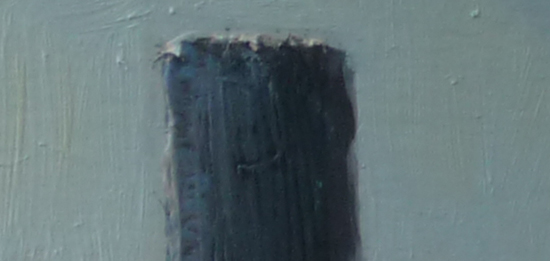
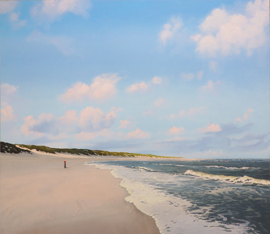
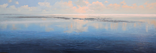
Foggy Sunrise, oil on panel, 15 x 50 cm


So to prevent that I'll give you my 5 tips for a successful exhibition (apart of course from doing brilliant paintings):

1. Make sure you're in the right gallery.
Duhuh, I hear you think. But it's is not as self evident as it seems. If you don't get a lot of opportunities to show your work, you maybe tempted to be content with the mere fact that a gallery invites you at all. Still it makes sense to do some research to find out if your work fits in. Look at their artists and maybe write one of them an email to find out what the gallery is about.

2. A prompt answer says a lot.
When I receive an email from a gallery I try to respond the same day, or the next day at the latest. I like my galleries to do the same. When it takes them a week (or sometimes more!) to answer they should at least apologize for their late response. Otherwise: forget it. It takes a lot of effort, time and money on your part to participate. The way a gallery communicates with it's artists says a lot about the effort they're going to put in. Some of the worst experiences I had could have been avoided if I just paid attention to their reaction time.

3. Do the paperwork.
When you're working with a gallery for the first time it's a good idea to have the gallery conditions on paper. At least have them confirm by email the most important points: their percentage, the exhibition period, the number and sizes of the works, insurance, that kind of stuff.

4. Do the numbers.
When you've done your homework you know which price range the gallery is in. For a successful exhibition it's important to stay within that range. If you have to change your prices to fit in, remember: once you raised them it's a problem to lower them when times get hard. Galleries hate it when that happens. It sends a message to their buyers their artists are overpriced.

5. Enjoy the ride.
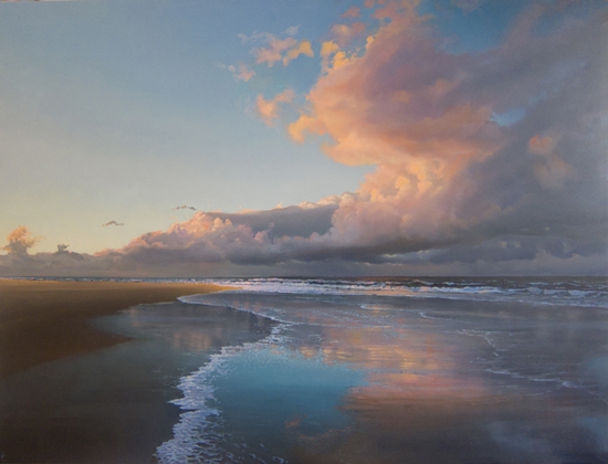
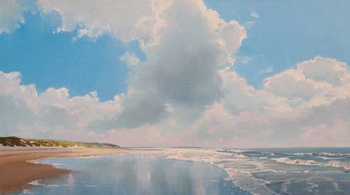
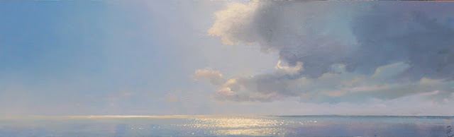
With all these do's and don't's you'd almost forget the reason for all this: painting. For an exhibition like this I like to focus on a certain aspect of my work. Last time I did a lot of reflections, this time it's going to be clouds, my core business. I enjoy visualizing the gallery filled with my works, each one of them absolutely brilliant of course. Can't wait to turn my ideas into actual paintings. I'll keep you posted.

Thursday, September 14, 2017

New oil sketches

Don't feel like writing a lot this week, so I thought I'd do a little self promotion. 

A week ago I put 4 new oil sketches on paper online. Two of them already found a new owner, two are still available for a friendly price, passe partout and shipping included. If you're interested, please go to my webshop at http://www.janhendrikdolsma.nl/paintings/. Thank you!

(If you read this in, let's say, October 2018 there is a possibility the above is no longer valid...)


Clouds in Backlight, oil sketch on paper, 8.7x15.7"

Cloud Mirror, oil sketch on paper, 11.8x15.7"


Friday, September 1, 2017

Little lies

Every time I put a picture of my work online I'm not totally telling the truth. Not totally lying either, but still. Let me explain. At first sight the two pictures below seem to be photographs of the same painting, but one is a small oil sketch on paper and the other is the finished painting on panel.

Evening Clouds, 11.8x17.7", oil on paper
Evening Clouds, 35.4x47.2", oil on panel

A little over a year ago I made them for an American buyer. To give her an idea of what I intended to do I made the sketch. It's about a third of the size of the finished painting. When you see them like this on your screen they seem to be almost identical. I'll show you some details to demonstrate they're not.


Now I seem to be telling you the truth, but am I? Displayed like this the two details are still misleading, because you see them at the same size. If you really want to compare the two I'd have to show them in a 1 : 1 ratio .

Like this:


And even now these pictures are only telling part of the truth, even though they're the size they have in reality. You're not seeing them in the totality of the painting, they're isolated fragments. And of course you're missing out on the reality of the painted surface. You can't look at it up close and then step back. 

Only way to overcome this problem is go see one of the exhibitions I'm participating in (http://www.paintingskies.com/exhibitions/) If you can't make it there, well, you got to make do with the little lies I tell you...


Thursday, August 17, 2017

The brush and the saw

Lately I've been struggling with a 12x20'' painting. Never got to the 'now-we're-getting-somewhere' point. In the same period I sold a 6x20'' painting to a buyer who didn't care for the frame, so I had a spare frame. Of the same width. One plus one is two, eh? I digitally cropped the picture of the original painting to a size that would fit the spare frame and I really liked the result. But there is a difference between Photoshop and reality: cmd z. Once the panel has been sawn in two you can't restore it with a simple keyboard command. 

The 12x20" version, before cropping

I slept over it a few nights and then decided I would go for it. I don't have the tools to get the job done, but I live in a town where they have something called a 'stadswerkplaats', a city work shop. It costs next to nothing, they have all the tools and if you're a bit clumsy (like me), they're always willing to help you.

I just got back from the work shop and placed the new painting in the frame and I must say I'm really pleased with the result.

Which goes to show that a painter needs more tools than just a brush.

Sun & Mist, oil on panel, 6x20"

Now I have a new problem: what to do with the leftover part...


Thursday, August 3, 2017

the marouflé technique

As some of you may know I often make oil sketches on paper in preparation of larger works on panel.  I sell them for a friendly price on my website. My frame maker produces wonderful passe partoux to protect them during transport. They look great behind glass. 

But every now and then a buyer wants a proper frame instead of a passe partout. In cases like that my frame maker applies the so called marouflĂ© technique. The word 'maroufler' is French and it sounds quite poetic, but it actually means 'to rub'. The painting (or the drawing) is fixed to a solid ground, such as MDF. When it's done properly you can't see the difference with a panel painting. 

Beach with Clouds in Backlight, 9.8x15.7", oil on paper, marouflé

A long time ago I used to do it myself, but to be honest, I'm not a real handy man, so the results often left to be wished for. But if you insist on doing it yourself, this is how it goes:
- The ingredients: acrylic binder, a solid surface (MDF, masonite), a spalter, a credit card, books and a sharp knife
- The paper must be slightly larger than the panel you're going to mount it on. Later on in the process you'll have to cut off the parts that stick out.
- Thin the acrylic binder with water 1:1
- Bring it on with the spalter on both surfaces, the board as well as the back side of the paper. Be sure to have a smooth surface. No humps and bumps. Use the credit card to even out irregularities.
- Now gently put the paper on your board and rub (there it is!) the paper surface from the center to the edges
- Let it dry under pressure (this is where the books come in) for about 24 hours.
- Cut off the parts of the paper that stick out with your sharp hobby knife. And when I say sharp I mean razor sharp. A blunt knif will completely ruin your work.
- Done!

I'd try the frame maker.

Friday, July 21, 2017

Theory

Probably every artist and certainly every gallery owner always wonders why one painting sells and another one doesn't. They're hoping to find some kind of secret rule that predicts success or failure. Quite useful in an unpredictable environment like the art business. Now take a look at the paintings below and in particular at the year in which I painted them.

Passage, oil on panel, 35.4 x 47.2", 2007

Shore Line, oil on panel, 15.7 x 19.7", 2011

Sunset with Storm Clouds, oil on paper, 11.8" x 15.7", 2016

The first painting is not exactly  a happy painting, with it's dark sky and the suggestion of bad weather. Now look at the date: 2007, one year before the economic crisis. Sales went through the roof and everybody was quite optimistic. The second painting was painted in the middle of the crisis (2011). A bright sunny painting, while the overall mood was pretty down. The third painting is again a rather dramatic, dark scene. The date is 2016. The crisis is over and our ideas about the future are much brighter than five years earlier.

My idea is that people only buy paintings with a dark mood when everything is fine and the mood is optimistic enough to stand a little drama. During the crisis people had enough trouble of their own and they weren't about to pay good money for more gloom & doom. No chance I would've sold a painting like the first one. Sunny works, like the second one, still sold, though  sales went down considerably. Now in 2017 the crisis is over and there is again room for paintings with a dark atmosphere.

Of course this is not an entirely new idea. During the crisis of the nineteen-thirties the great American  show movies with song and dance did very well. Probably the same mechanism. Maybe I should try my luck with a couple of heavy skies again...

Thursday, July 6, 2017

Indanthrene Blue

Sometimes I ask my wife (when she's going downtown to shop) to buy me some painting materials. She doesn't always stick to the list I give her. Or rather she brings home more than is on the list. That's how I started working with Transparent White for example. She's an accomplished painter herself and she knows what she's doing. This time I asked her to buy a few tubes of Ultramarine Blue, which she did, but on top of that she bought me Rembrandt Indanthrene Blue.


Now I don't know about you, but I never heard of Indanthrene Blue. It turns out to be a valuable addition to my palette (I told you, she knows what she's doing!). I hope the above picture gives you an idea, but I'm afraid the intensity of the color will get lost on the screen. It's a very deep and rather warm blue, a bit like Ultramarine, but darker.

Most blues loose color pretty quick when you add white and that's a problem when you need a very light sky that is still distinctly blue. Well, this one keeps it's color, even mixed with a considerable amount of Titanium White. I used it in the beach scene below. Just added a hint of Caribbean Blue (mostly in the lower part of the sky). I am really pleased with the result. This is probably not the last time I'll use Indanthrene Blue!


Rising Tide, oil on panel, 27.6 x 31.5"

Friday, June 23, 2017

Levels

'The level at which you're trying to solve a problem is often not the level that causes the problem.' 

I don't remember who said this. I picked it up sometime during the nineties, when I was still teaching art classes. It often helped me to look at a problem from a different angle and this goes for painting problems as well. Here's a painting I recently finished.

Summerwind, oil on panel, 11.8 x 19.7"


This is what it looked like in an earlier stage. Lots of fluffy clouds. I had been struggling with them for some time. Adding detail, changing color, what have you. Nothing worked. For some reason the painting lacked focus, it was in fact unclear to me what I wanted it to be about. When I replaced the clouds with a blue sky I suddenly knew: it's about the sunlit area behind the dune (that you can't even see) and not about the clouds. Once I saw that, it was a piece of cake: I brought more color and light to the sky behind the dune and within half an hour I decided the thing was finished...

Of course I didn't look at my painting and thought: 'The level at which I'm trying to solve this problem is not the level that causes the problem.' I solved it while painting. But still, what happened is that I approached it from another level. Maybe I should remember it the next time I get stuck...

Friday, June 9, 2017

Muddy waters


I usually post a new entry every two weeks, but this time it has been a little longer. I was occupied elsewhere. On Madeira, to be exact. Madeira is a small volcanic island, a speck in the Atlantic. It's the place where Sisi went to cure her tuberculosis. There's a small statue of her where people still put flowers.

Madeira is stunningly beautiful. Flowers everywhere, fantastic scenery and a deep blue ocean. I spent quite a few hours at the waterfront, looking at the Atlantic. I'm used to the North Sea, which is, well, a bit muddy. The color of the water is often brown- or greenish because of the sandy bottom. The Atlantic on the other side is very clear. We saw dolphins swimming underwater! When you see a fish swimming underwater in the North Sea you've probably been drinking.

The painting below was inspired by yet another sea, The Wadden Sea. It's a tidal landscape that partly falls dry at low tide. On the map you can find it between the Wadden Sea islands and the Dutch mainland. It stretches all the way to Denmark. Now here is a sea that is defined by the presence of sand. A lot of sand. When high tide comes in it deposits sand from the North Sea on the banks, that fall dry at low tide. If you're lucky you can spot seals on the banks, chilling in the sun.

A lot of my work is inspired by this particular stretch of water, always changing and moving with the tide. Even the islands move slowly to the east. Now I don't sea Madeira doing that...


Smooth Sailing, oil on canvas, 27.6 x 47.2"

Friday, May 5, 2017

The mirror

Everyone who has ever done any painting has experienced it: you have no idea what you're looking at anymore. Does your painting still make any sense or is it a total failure. Especially after a long painting session you loose perspective of what you're doing.

Most painters have a trick or two to overcome these situations. One of them is asking a person whose opinion you value to comment on the painting. Looking at your work through somebody else's eyes can be quite refreshing, though not always a pleasure. Still, honesty is required if you want the critique to be of any value. I'm lucky to have a few honest people close at hand.

Another way to get a fresh view is to take a picture of your painting, open it in Photoshop (or similar software) and fool around with it for a bit. What happens if you give it more contrast or less light? If you know your way around this kind of software, you can change the color of certain areas and see what happens.

A much simpler trick is the mirror. When you look at your painting in a mirror you almost always see stuff that you missed before. I don't know exactly why. I think it has to do with the fact that the mirrored image is relatively fresh, but it's also easier to see your painting as a whole, instead of as a bunch of inconsistent details.  Whatever the reason, it works, at least it does for me.

Oh, yes, I almost forgot the easiest of them all: take a break...


Thursday, April 20, 2017

Warm-cold contrast

I finished my studies at the Minerva Art Academy (the Netherlands) in 1973 and in 1974 I got a teaching job for three days a week. Though I liked teaching I actually wanted to do something completely different, so after a few years I decided to quit and do what I really wanted to do: make music. No more room for painting. I had a great time as a musician. Made just enough money to survive, but after a few years, when the band split up in the early eighties, I went back to teaching.

It was only till the mid-nineties that I suddenly felt a deep urge to start painting again and that's what I did. Of course my subject was the landscape of the Dutch coast, it's light and it's space. I remember how I struggled, mainly with scenes that had dark clouds and sharp contrasts. I almost always felt the clouds were way to dark and heavy, but when I lightened them up, I lost contrast.


In the course of the years I slowly found out that the contrast between warm and cold colors is sometimes a very effective replacement of the light-dark contrast. I could keep my clouds lighter by contrasting them with a warmer area instead of a lighter one. In this detail (of a painting I'm still working on) I used a glaze of burnt Sienna.


On top of that the warm-cold contrast makes your painting come alive, much more than a mere light-dark contrast will. In the above picture I digitally removed the color of the warm burnt Sienna glaze, without changing the rest of the colors. Bit dull, eh? Without the glaze I would've been forced to either make the clouds darker or the background lighter. Like the great Johan Cruijff once said: "You don't see it till you see it".


Thursday, April 6, 2017

Painter with a writers block

Usually I enjoy writing a new blog entry every two weeks. I start thinking about it on Monday, I write it on Wednesday, check it on Thursday and publish it on Friday. But this week was different. I often get the idea for an article during my daily walks, but no matter how far I walked, nothing happened.

So, dear readers, this will be all for this week. See you in fourteen days.

Clouds in Backlight, oil on panel, 9.8 x 17.7"

Friday, March 24, 2017

Oils on paper #2

In my November 25 (2016) blog entry I wrote about the fake canvas texture of my oil paper pad and asked anyone who had found a smooth oil paper pad to let me know. A few weeks later a very kind lady wrote me an email saying she bought her pads in Germany without the texture. Another few weeks later she even brought it along to my studio. Lots of kind people in the world.


Last week I made a number of oil sketches for a possible commission, one that was a bit outside the normal range. The client wanted a large painting, with nothing but a big, dark sky over the ocean. Most of my commisioners ask for sunny beaches, so this one triggered my imagination and I made not one but three sketches. On the new pad.


I like it so much better than the fake canvas paper. It's a lot more like painting on panel. Only possible downside is that you cannot remove a layer like you can on a wood panel. But hey, you can't have everything.  I did get the commission though.


For those of you interested in the new pad, here's a picture.


Wednesday, March 8, 2017

The color of the beach

Whenever I get an email how to mix the color of the beach I have a hard time giving an answer. Problem is, there is no color of the beach, there are countless colors of just as many beaches. Even in my home country (pretty small country as you may know) the sand has different colors on different islands. Sometimes a little reddish, sometimes with a hint of ochre.

From time to time I find new combinations to mix an okay sand color, like in this recent painting. The bottom layer is a mix of flesh color (Lukas) and a bit of yellow ochre. To tone it down in the second layer I applied a rather thinned glaze with lots of transparent white, indigo (Rembrandt) and again ochre. It's just a small part of the painting, but I like it.

Untitled work in progress, 13.8" x 39.4

Very often the Lukas flesh tint is the starting point of my beaches. If I need a pale, almost colorless, beach I'll add a little sepia. If I need a soft brown beach I'll add a little burnt umber and sometimes even burnt sienna, though most of the times I'll have to tone that one down with a glaze of some kind.

Shadows on a beach often have a hint of purple, be it of a cloud or a dune. Old Holland violet-grey makes an excellent shadow color in a mix with transparent white, flesh tint and maybe a little ochre. Works just great when you glaze it on top of an existing beach.

Anyone with new recipes? Let me know!


Thursday, February 23, 2017

The artist as a marketeer #2

I have always been drawn to trying my luck abroad. Not only because Holland is a small country with a small art market, but mostly because of the excitement. And that's what you get, though not always the kind you hope for. A few years back I showed my work at a Greek gallery. Getting the work there was no problem, getting it back was a different story. It turned out that for every art work you want to ship out of Greece you have to get permission from a Greek state committee. In the past the Greeks have been robbed of their art treasures, so I don't blame them. I got my paintings back in the end, but my shipper's bill was a bit higher than expected. The committee is seated in Athens and I had to pay for the detour. Of course I should've known this beforehand, but if I did, I probably wouldn't have bothered and missed all the excitement.

The funny thing is that, whenever I approach a foreign gallery directly I'm never successful. I get a rejection mail at best. Successful exhibition opportunities come from galleries that get in touch with me. Thanks to the world wide web.

Misty Passage, oil on panel, 19.7" x 59.1"

Let me tell you about my cyber empire. It has four interacting elements. Sounds like I'm an expert, eh? In reality it slowly grew by trial and error. By regularly posting a new article on my blog or a new clip on my YouTube channel I hope to draw visitors to my website (www.paintingskies.com), where they can find information about my work, buy a video or even a painting.

In the previous article about the artist as a marketeer (September 5, 2016) I mentioned the importance of collecting email addresses and sending a newsletter. Every time I want people to know I posted a new video on YouTube, or new paintings on my website I send out a newsletter. Because I've been collecting email addresses for years it reaches thousands of subscribers. A newsletter always generates traffic on either the YouTube channel, the blog or the website. (By the way: if you want to subscribe to my newsletter, please send me an email at info@janhendrikdolsma.nl.)

Let me emphasize this is not some sort of standard recipe for success. It's just how I've done it and it works. It didn't make me a millionaire, but it sure helps keeping the ship afloat. And it connects me to people all over the world, who respond to my videos, ask me questions or just want to compliment me on my painting. Love it.

Thursday, February 9, 2017

Painting a seascape

I just finished working on a seascape. I must admit I'm not a specialist, but every now and then I give it a try. In this case the reason was a commission. Though I was quite content with the result, the buyer rejected it. Turned out after all he wanted a beachscape. I should've made an oil sketch, like I usually do...

Evening Surf, oil on panel, 13.8 x 39.4"


Painting waves is a real joy. The best part is painting the foam. You can let the paint do the work. The painting technique I use always depends on what I'm painting and when painting foam I can go all the way in using impasto techniques. No need to smooth out my brush strokes (like in for example the blue of the sky). The texture only adds to the dynamic of the wave rolling over.


Because this is an evening scene I get to paint lovely warm accents with lots of paint on my brush. Still, it's not all impasto. Glazing can be very useful here as well. For the shadow part of this wave I used a glaze of transparent white mixed with ultramarine and a bit of sepia. Works great.


But like I said, I'm not a specialist. Maybe you should take a look at the work of a real seascape painter like David Smith (http://davidlyttletonsmith.com).


Thursday, February 2, 2017

North Sea Beach

Quite a few people presume that when you're a professional painter you always know exactly what you're doing and that you control the outcome of each painting. Sorry to break the news, but even when you paint for a living the whole process can be downright frustrating and sometimes you run into a really stubborn painting that drives you nuts. Sounds familiar?


Last week I uploaded a 5 min. video on YouTube that tells the story of 'North Sea Beach' (oil on panel, 33.5 x 59"). Let me know if you have a similar story!

Thursday, January 19, 2017

Painting techniques #2

In my previous blog entry I mentioned two painting techniques I often use (glazing and impasto). This time I want to talk about two other techniques: one gave it's name to a late nineteenth century art school (Pointillism), the other is about making smooth transitions. I used both techniques in 'Evening Clouds over the Ocean'.


Evening Clouds over the Ocean, oil on panel, 47.2" x 63"


The below detail is part of the ocean, just left of the center. It's about 3.5" x 2.5". As you can see I painted a lot (a lot) of dots on top of a purple-ish ground layer. This is not according to the rules of the French Pointillists, who covered their entire painting with dots. The similarity is what is called 'optical mixing'. It means that, seen from a distance, your eyes mix the dots to a single color. The result is a vibrant surface. You'll never get this kind of surface when you mix the color on your pallet. I use it mostly when I paint the ocean to suggest the movement of the water at mid-distance. In my Painting Reflections tutorial you can see an example.


The realism of my work is for the greatest part the result of smooth transitions. Even in the above detail you can see I painted the dots on top of such a transition. The color of the sky is another example. From the left to the right it slowly changes from almost yellow to a dark blue. To achieve this I use a technique called stippling and a badger hair fan brush. In my Painting Clouds video I show how I do it.


Friday, January 6, 2017

Painting techniques

Just like most painters I don't use just one single painting technique. Depending on what I want to paint I choose the technique that will get me there. Let me tell you a few things about two of them: glazing and impasto.
Glazing is an age old technique, dating back to the 15th century. You apply thin, transparent layers on top of each other. Impasto is at the oppsosite side of the what-can-you-do-with-paint scale. You paint in thick, opaque layers that almost seem to come out of the canvas. Where as glazing tries to avoid texture, impasto is all about texture. In my painting 'Neap Tide' I used them both.

Neap Tide, oils on panel, 30 x 90 cm
In the lower part of the painting glazing was the  dominant technique. On a dry bottom layer of dark blue I painted an even darker blue, a mix of indigo, Prussian blue and sepia. This mix was extremely thinned down with Liquin Light Gel, so the first layer was still shining through. With a cloth I then 'drew' the shapes of the small waves in the foreground by removing the dark glaze. By doing so the first blue layer became visible again.
The next day I painted a mix of transparent white, ultramarine and sepia on top of the glaze, to soften the contrast between the bottom layer and
the glaze.

So, if you want to preserve your bottom layer but give it a different hue or partly place it in the shadow, glazing is a great option. You'll be surprised by the results.

The sparkles at the horizon make up the lightest part of the painting. Here I used impasto. As you can see there's a fine texture formed by an awful lot of dots, each individual dot painted with a very fine brush. Here I used less Liquin to prevent the dots from flowing out into the background. Every dot has to stand out from the surface.That's important, because I want it to catch as much light as possible. The combination of the color (titanium white, vermillion red) and the 3D texture of the dots results in a surface that reflects a lot of light, which hopefully leads to the suggestion of sparkles on the water.

If you want to find out more, please go to www.paintingskies.com/video. In the meantime, if you have questions I might be able to answer, please let me know!