

Wednesday, December 21, 2016
Friday, December 9, 2016
sales
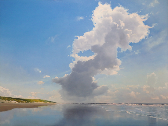
I'm a happy little painter these days. For some reason my sales are spiking. Funny enough this is not just the case in one area, like for example the galleries, but online sales and commissions are doing great as well. The year started very low-key, but it looks like it's going to end on a happy note.
Of course I wondered why this is happening, and of course I have no answer. Is it the result of the growing economy? I have my doubts. The art market (at least the segment I'm in) hasn't recovered yet.
The economic crisis has been quite a challenge, that's for sure. But the good thing about it was that it forced me to find new ways to promote and sell my work. In 2009 I started a newsletter and build an email address data base. Shortly after that I began posting short clips on YouTube, in later years followed by two full length tutorials. At the same time I started the Painting Skies blog. In 2013 I began selling my work online, first the oil sketches on paper and lately I added the small size panel paintings.
 | |
|
I flatter myself by thinking that all these activities are the cause of the present sales spike, and to some extent that's probably the case. But the truth is I have no way of telling what the real cause is. The truth is you can work your but off and still have zero sales. The truth is (and that's pretty hard to accept for a control freak like me) you got to have some luck too. Without it noone is going to do wel...
Friday, November 25, 2016
Oils on paper
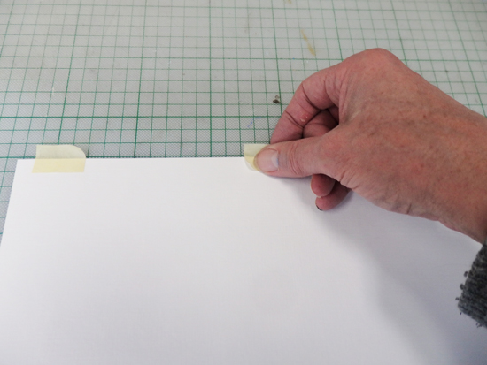 |
| Taping the back of the paper |
I buy my oil paper pads online, 50 sheets of 240 grs paper, 30 x 40 cm (11.7 x 15.8"). The one I buy has this fake canvas texture. Unfortunately I was unable to find smooth oil paper, so if there's someone out there who did find it, please let me know.
 |
| Ready for use |
Anyway, I made a number of fresh oil sketches on paper. Below is an example. If you want to see them all (or buy one) please go to the online sale section of my website, http://www.paintingskies.com.
 |
| Breakers on a Peer, oils on paper, 11.8 x 15.7" |
Thursday, November 10, 2016
Letting your paintings go
Last week somebody asked me how hard it was to let my paintings go when they're sold. She obviously presumed it was hard by definition and only wondered how hard. She looked at me with a bit of disbelief when I said it didn't bother me. A painting has to be looked at, not stored somewhere. But she's got a point: there are quite a few artists who have a hard time parting with their work.
For example a dear friend of mine. Every time he drops off his work at an exhibition, he's in doubt. The reason is that every work is like a page in a book for him, they're all interconnected. Tear out a page and the story doesn't make sense anymore. Every time a work is sold he wants the address of the buyer, just in case he needs this page for a specific exhibition. This Sunday, at the opening of a show he participated in, I purchased one of his small works, but only after inquiring if it was okay with him.
For example a dear friend of mine. Every time he drops off his work at an exhibition, he's in doubt. The reason is that every work is like a page in a book for him, they're all interconnected. Tear out a page and the story doesn't make sense anymore. Every time a work is sold he wants the address of the buyer, just in case he needs this page for a specific exhibition. This Sunday, at the opening of a show he participated in, I purchased one of his small works, but only after inquiring if it was okay with him.
 |
| Windfall, oil on panel, 15.7" x 47.2" |
For me it's totally different. In every painting I'm trying to say more or less the same thing. I just try to say it better or from a different angle. I'm still not exactly sure what it is I'm trying to say, but I'm pretty sure it's always the same thing. And when a painting is sold, I still get a buzz. It's very rewarding, in a non-financial way, if someone spends a considerable sum to own one of your works. And the money is nice too, let's be honest. A fellow-painter said to me: "Would I paint if I wouldn't make any money with it? Yes, I would!" Same here. The money just makes it better.
Friday, October 28, 2016
Web shop
A few years back I started my own web shop to sell my oil sketches on paper online. I wasn't at all sure if it was going to be a success, but I was lucky: almost every painting I put online found a new owner. And then I got a bit overconfident and thought: "why not put the small size panel-paintings online as well?" And that's what I did. When you visit my website and you hit 'online sale' you'll be presented with eight paintings, the largest of which is 11.8" x 17.7". Small size, small price, frame and shipping included. Two of them below. Hope you like them.
 |
| Brightening, oils on panel, 5.9" x 17.7" |
 |
Little Clouds, oils on panel, 9.4" x 11.8"
|
Friday, October 14, 2016
Mixin blues #2
In my previous blog entry I told you how I use my blues: never straight from the tube and often in transparent layers. I also promised to get a little deeper into the use of each different blue. Please note that titanium white is practically always a part of the mix, even if I don't mention it.
Here we go:
- Kings blue light: the starting point for mixing a lot of different blues. It's a nice, soft and not to outspoken blue. Goes perfectly with a little Naples yellow to get the greenish blue you often see close to the horizon. Or with other blues if you want to mix a darker sky color.
- Kings blue dark: don't use that a lot, mostly in a mix with kings blue light when I'm painting a smooth transition to a darker blue.
- Cobalt blue: one of my favorites at the moment, mostly in combination with a hint of Caribbean blue, which gives it a greenish hue. I often use it for the darker part of a blue sky, but in the lighter parts (when mixed with titanium white) it's still a strong color.
- Ultramarin blue: a warm, purple like blue. I use it in more or less the same way as cobalt blue. Also a great color for glazing shadow parts of the foam lines on the beach.
- Ceruleum blue: a greenish blue, but not as saturated as Caribbean blue. I often use it mixed with indigo in the darker parts of a reflection. When mixed with vermillion red and titanium white it gives a wonderful gray. In my YouTube clip Mixing Colors it's one of the grays I demonstrate.
- Indigo: I use two diferent brands of Indigo: Royal Talens and Lukas. Though they have the same name they differ considerably. The Lukas indigo is almost purple, while the Talens indigo has a more neutral dark tone. I use the latter quite often, most of the time for the color of the ocean and every now and then as a thin glaze in the shadows of a cloud. I sometimes mix the two indigos if I need a very dark color. Black isn't a part of my pallet and as a matter of fact this mix looks so much better than black, especially when I add just a bit of magenta.
- Prussian blue: don't use it a lot, but if I do it's mostly in a mix with the Talens indigo for the dark part of a late evening sky
- Caribbean blue: a very powerful green blue, the color of the Caribbean ocean. See cobalt and ultramarin.
- Old Holland blue-violet: a very deep purple blue, which I use exclusively to mix several shades of gray. The starting point is often Naples yellow, but the combination with other yellows works great too. In my Painting Clouds tutorial I demonstrate how I do it.
- Old Holland violet-gray: a wonderful soft violet, which I often use as a glaze (in a mix with transparent white) for the shadows of backlit clouds. My Painting Reflections tutorial shows how.
I seriously wonder if this is of any use to anyone. I think I would have quit reading after the first line... You'd really have to try it yourself to get an idea what these colors do in reality. If you have any questions or comments, please let me know!
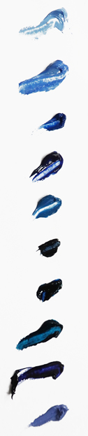
Here we go:
 |
| Cobalt and Caribbean blue in the upper part, kings blue and Naples yellow just above the horizon |
- Kings blue dark: don't use that a lot, mostly in a mix with kings blue light when I'm painting a smooth transition to a darker blue.
 |
| Royal Talens indigo with just a hint ofPrussian blue in the upper part of the sky |
- Ultramarin blue: a warm, purple like blue. I use it in more or less the same way as cobalt blue. Also a great color for glazing shadow parts of the foam lines on the beach.
- Ceruleum blue: a greenish blue, but not as saturated as Caribbean blue. I often use it mixed with indigo in the darker parts of a reflection. When mixed with vermillion red and titanium white it gives a wonderful gray. In my YouTube clip Mixing Colors it's one of the grays I demonstrate.
- Indigo: I use two diferent brands of Indigo: Royal Talens and Lukas. Though they have the same name they differ considerably. The Lukas indigo is almost purple, while the Talens indigo has a more neutral dark tone. I use the latter quite often, most of the time for the color of the ocean and every now and then as a thin glaze in the shadows of a cloud. I sometimes mix the two indigos if I need a very dark color. Black isn't a part of my pallet and as a matter of fact this mix looks so much better than black, especially when I add just a bit of magenta.
- Prussian blue: don't use it a lot, but if I do it's mostly in a mix with the Talens indigo for the dark part of a late evening sky
 |
| Caribbean blue in the upper part, mixed with kings blue above the horizon |
- Old Holland blue-violet: a very deep purple blue, which I use exclusively to mix several shades of gray. The starting point is often Naples yellow, but the combination with other yellows works great too. In my Painting Clouds tutorial I demonstrate how I do it.
- Old Holland violet-gray: a wonderful soft violet, which I often use as a glaze (in a mix with transparent white) for the shadows of backlit clouds. My Painting Reflections tutorial shows how.
I seriously wonder if this is of any use to anyone. I think I would have quit reading after the first line... You'd really have to try it yourself to get an idea what these colors do in reality. If you have any questions or comments, please let me know!
Thursday, September 29, 2016
Mixing blues
 Got a request from Ash Aravind to either make a Youtube clip or write an article on my blog about mixing blues. Thanks for the tip, Ash. I'm a bit busy at the moment, so the clip will have to wait.
As you may have noticed, blue is a pretty important color in my work, so I have quite a few different shades of it, ranging from cold greenish to warm purple-like blues. I practically never use it straight from the tube, I always mix it with other blues, sometimes even with yellows or reds. And of course with titanium white, always titanium white. The only one I sometimes apply straight from the tube is kings blue light.
I also mix them by using transparent layers. Usually my colors are thinned down, so I need multiple layers to get the color intensity I'm looking for. I use this transparency to create very deep, intense blues. Not necessarily dark blues, but the transparency creates an interaction between the different layers that adds to the intensity.
For example: in the bottom layer I sometimes paint a smooth surface of ultramarine. When this layer is dry I paint a mix of cobalt and Caribbean blue on top of it. The Caribbean blue gives the cobalt a greenish hue, which tones down the much warmer ultramarine. I sort of accidentally stumbled across this combination and I was struck by its intensity, even when mixed with white.
These are the blues I use in order of appearance:
1. kings blue light
2. kings blue dark
3. cobalt blue
4. ultramarine blue
5. ceruleum blue
6. indigo
7. Prussian blue
8 Caribbean blue
9. Old Holland blue-violet
10. Old Holland violet-grey
There are of course many more blues on the market. This is just my personal selection. Next time I'll tell a bit more about what I use each color for. If you like to receive my complete color list (including the reds & yellows), please send an email to info@janhendrikdolsma.nl and I'll send you the list asap.
Thursday, September 15, 2016
Exhibitions
During the years I participated in quite a few exhibitions, most of them group shows. There are very few galleries left (at least not in Holland) that still host solo shows. They have their reasons, but for the individual artist it's a bit sad. You want to present the full scope of your work and not just two or three little paintings. Luckily for me there is a gallery in The Hague (De Twee Pauwen or The Two Peacocks) that still offers artists the opportunity to present their work in solo- or duo shows. This coming October it's my turn again.
The first thing I do when I start working on a project like this is create a folder in my computer and line up the paintings I already planned to do. For some of them I made oil sketches, others did not get past the Photoshop design phase. Always far more than I can possibly do in the given time span, so I make a new folder within the initial one, the 'first choice' folder and I start to move paintings in and out of it. This process can take quite a while, up to a few weeks. Actually, it goes on right until the end, when I start doubting every choice I made. But since it's not the first time this happens, I'm now able to look at it from some distance and I don't wake up anymore in the middle of the night with only one thought: "You've got it all wrong, you got to start all over again!". Now I only worry after sun up.
A friend of mine recently mailed me a line he read somewhere: "A satisfied artist is a contradictio in terminis". I tell myself to hold on to that thought...
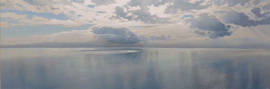
 |
| Big Cloud, 70 x 120 cm, oils on panel |
I've been working for the occasion for the last six months or so and I just loved it. It's such a pleasure to work towards a balanced presentation and not just jump from one painting to the next. But now that the opening date is drawing near I'm beginning to get a little shaky. As usual I must say. Happens every time. I'm getting second thoughts about practically every choice I made. Did I pick the right sizes, shouldn't they be larger/smaller, isn't the subject matter to divers/to one sided, didnt I paint to much/not enough sunsets. The list goes on and on.
The first thing I do when I start working on a project like this is create a folder in my computer and line up the paintings I already planned to do. For some of them I made oil sketches, others did not get past the Photoshop design phase. Always far more than I can possibly do in the given time span, so I make a new folder within the initial one, the 'first choice' folder and I start to move paintings in and out of it. This process can take quite a while, up to a few weeks. Actually, it goes on right until the end, when I start doubting every choice I made. But since it's not the first time this happens, I'm now able to look at it from some distance and I don't wake up anymore in the middle of the night with only one thought: "You've got it all wrong, you got to start all over again!". Now I only worry after sun up.
A friend of mine recently mailed me a line he read somewhere: "A satisfied artist is a contradictio in terminis". I tell myself to hold on to that thought...
Thursday, September 1, 2016
Cleaning brushes
About ten years ago I threw out terpentine and all terpentine based media. I hated the smell and I didn't need the health hazards. All I had to do was find a solution for the problem of cleaning my brushes. My wife came up with a brilliant and simple plan: why not clean them with oil, the kind you see in any household?
Like I said, brilliant plan, but there was a second problem. When you clean your brushes with household oil, they'll be, how do I say, kinda oily and not fit for painting use. She then thought of yet another plan (she's really smart), which was to remove the oil by washing the brushes with shampoo, if possible with conditioner.
The combination of oil and shampoo works miracles. My brushes are softer than ever and they don't wear out as fast as they used to. I have a number of water color brushes for example that I bought a few years ago and they're still in great shape. If I cleaned them with turpentine, they'd be in the trash for a long time.
Another advantage of this method is the re-use of the oil. I pour the used oil in an old bottle and let it rest for a few weeks. The pigment slowly sinks to the bottom, leaving a relatively clear oil, that I can use again. And again. I can go for months with just a bottle. Good for the environment too. It doesn't matter which oil or shampoo you use. I always buy mine from the bottom shelf in our local supermarket.
The only downside is I need a lot of brushes, because I can't clean them while I'm working. At least not like I used to with turpentine. I use a painting cloth and tissues to squeeze out the paint, but it usually doesn't take long before I have to take a fresh brush.
If you got to the end of this article, you really must be a painting aficionado. Thanks for bearing with me. Next time I'll talk about something really deep...
 | |
|
Wednesday, August 17, 2016
Oils and acrylics
Here's a question I've been asked a lot of times: "I'm working in acrylics and I wonder: is it any use to buy your videos since you work in oils?" Well, for me it's always useful when someone buys my videos, but I'm not sure the glazing technique I use can be translated one on one to acrylics. It's been quite a while since I used them, and to be honest, I wasn't much good at it. They dried to quickly for my liking. Since then a lot of new stuff has come on the market, such as acrylic retarders. I never worked with them, so you won't get a lot of information out of me.
Great, eh? A blog article, that doesn't give you any answers whatsoever. Or maybe just this: when you google 'glazing with acrylics' you get a gazillion hits, so I'm pretty sure it can be done.
In my previous blog article I told you about the importance of email addresses. I planned to write a second one about it, but found the subject a bit to boring for two consecutive entries. Some other time.
In the meantime, if you have tried glazing with acrylics, let me know!
 |
| No title yet, oil on panel, 85 x 150 cm |
Friday, August 5, 2016
The artist as a marketeer #1
From the Renaissance on the ideas about what an artist was supposed to be began to shift slowly. The radical change took place in the nineteenth century. From a skilled and sometimes highly appreciated craftsman, often working for the king or the church, he became an opinionated genius, only interested in expressing himself. Van Gogh is iconic for this new kind of artist.
In the twentieth century the artist also had to be 'avant-garde'. He (almost always a he, but that's a different subject) had to break through the barriers of tradition and walk ahead of the crowd. A genuine artist had an extra sense for all kinds of trends in society, long before they surfaced. The-artist-as-a-mining-canary myth. And of course, money was no object, which led to another myth, the starving artist.
These concepts of what an artist should be resounded all through the twentieth century and even now they are still quite influential. Bad luck for me. I'm none of the above... I value craftmanship, I'm not interested in expressing my, let's say, 'inner landscape', I build on tradition, I don't have the ability nor the ambition to be a mining canary and yes, money is an object. A man's gotta eat.
Since the start of the economic crises in 2008 (time flies...) quite a number of the galleries I worked with went out of business. The ones that survived generally stopped hosting one-person shows and stopped selling large size paintings. Consequently I could no longer rely on the galleries and had to generate a larger part of my income from direct sales. The last few years this number has been steadily growing.
If you want to increase your direct sales the first advice I can give you is to gather email addresses. Build a database that contains everyone who ever wrote you an email about your work. Add everyone who might be slightly interested. This is of course an effort that will take a long long time, but it'll be worth it. You're going to need the addresses for your newsletter, your next step.
Maybe I'll tell you more about my efforts to market my own work in the next blog entry. You'd almost forget that all this business stuff has only one goal and that is to keep me painting. At the moment I'm reworking a painting I thought was finished about a month ago. This is what it looks like at the moment.
 |
| Cloud and Dune, oils on panel, 90 x 120 cm |
Later!
Thursday, July 21, 2016
Colored backgrounds #2
In my blog entry of June 24th I told you about my experiment with a colored background. You may remember I was quite pleased with the result and that I planned to repeat this approach. Well, I did and sooner than I thought.
The idea for this painting dates from a few months ago when I made an oil sketch of the same subject. Though I was pleased with the result, I wanted it to be even softer, more misty. It seemed to me that a colored background would provide an excellent starting point to get what I wanted. I used a warmer grey this time, a mix of Old Holland violet-grey and Old Holland yellow deep (a little more reddish than Naples yellow).

In the next stages I tried to bring the shapes of the clouds to the front by lighting up the areas around them. That was quite interesting, because it's the reverse of what I usually do, which is painting the shapes themselves.
 |
| Misty Sunrise, oils on panel, 70 x 120 cm |
The final image is the result of multiple layers of different greys. Rembrandt transparent white proved to be essential once again. I'm quite pleased with the painting. Hope you like it too!
Friday, July 8, 2016
Working plein-air
A friend of mine invited me for a trip on his boat. He owns a house near a National Park in the north of the Netherlands. Endless canals, interchanged by lakes. Quite impressive.
The weather prediction said 'a few local showers', but since I'm an optimist I thought 'local' would be somewhere else. I packed my drawing pad and a few pencils, hoping to do some drawing from the boat. It turned out that 'local' was right where we were and I only made one quick drawing.
 |
| Reflected Tree, pencil on paper, 14,2 x 21,6 cm |
It doesn't look like much, it's clear that I'm out of practice, but I enjoyed the experience. It's so simple: you take your pad and a pencil, you sit down somewhere and you're in for a few hours of fun. The result comes in second. For me, working from nature is about observation.
Don't forget your eraser. I needed it quite a few times and it was a great help in the reflection bit. I used an HB and a 3B pencil. HB for the outlines and the soft greys, 3B for the darker parts. The pad I worked on was a Tiger sketch book, 216 x 142 mm, 100 grs.
If you feel like sharing your plein-air stories, be my guest!
Friday, June 24, 2016
Colored backgrounds
When I was an arts student (sometime half way the previous century) I learned that it was only during the nineteen hundreds that the white background became common. Before that it was either the natural color of the canvas or a color the artist had applied. It seems the Venetians (Tintoretto and others) used a bright red ground for their work. This is of course all second hand knowledge and in the real world I have little experience with colored grounds. I used it a few times in the past , mainly for dune landscapes when I applied a Burnt Sienna ground. Gave the greens of the dunes on top of it a nice glow.
Anyway, for some reason I thought I'd try a grey background for a change. After applying it I got my cloth and 'drew' the clouds in the wet grey paint. At this point the painting looked like this:
I really liked the experience. The grey ground immediately unifies everything you do on top of it. The down side (like fellow-painter Dave Smith pointed out) is that your colors may not turn out as bright as with a white background. I wouldn't use it for a sunny beach scene. It's probably best suited for paintings with a soft atmosphere, like this one. I will certainly use it more often!
Anyway, for some reason I thought I'd try a grey background for a change. After applying it I got my cloth and 'drew' the clouds in the wet grey paint. At this point the painting looked like this:
And now it looks like this:
 |
| Sun in the Water, 33.5 x 59", oils on panel |
I really liked the experience. The grey ground immediately unifies everything you do on top of it. The down side (like fellow-painter Dave Smith pointed out) is that your colors may not turn out as bright as with a white background. I wouldn't use it for a sunny beach scene. It's probably best suited for paintings with a soft atmosphere, like this one. I will certainly use it more often!
Friday, June 10, 2016
Red Cloud
Last week I finished this large piece. It started with the picture on the bottom. I really liked this big, long cloud and how it moved from the left- to the right side in one go. Problem was the cloud had no point where it moved to. So I decided to flip the image and paint a sunset as the center of attention. Easier said than done...
I figured I was going to run into some serious problems, so I decided to make an oil sketch on paper before starting to work on the real thing. Some of the issues I had to resolve:
- If I flipped the image, the sunset would light up the other side of the cloud, so I had to figure out how and where the light would fall.
- Had to paint a sunset that would fit in with the rest of the clouds and paint a matching reflection.
 - Didn't like the diagonal line of the land wash in the picture, wanted something more interesting.
- Same for the ocean.
After painting the sketch I felt confident enough to begin the large painting. As you can see there are still quite a few differences between the sketch and the final piece. Which goes to show that you can't solve everything in a sketch. Still, I enjoy making them and they sure help in preparing for the final painting.
 |
| Red Cloud, oils on panel, 85 x 150 cm |
 |
| Red Cloud, oils on paper, 22 x 40 cm |
- If I flipped the image, the sunset would light up the other side of the cloud, so I had to figure out how and where the light would fall.
- Had to paint a sunset that would fit in with the rest of the clouds and paint a matching reflection.
 - Didn't like the diagonal line of the land wash in the picture, wanted something more interesting.
- Same for the ocean.
After painting the sketch I felt confident enough to begin the large painting. As you can see there are still quite a few differences between the sketch and the final piece. Which goes to show that you can't solve everything in a sketch. Still, I enjoy making them and they sure help in preparing for the final painting.
Friday, May 27, 2016
Studio lighting
In a perfect world every artist has a large studio with windows facing north. But since this isn't a perfect world my studio is pretty small and has windows on the north-east. I work at home, so we kinda live in the studio. A few years back I worked in the studio of an absent friend for about a year. Lots of room and the light was great. I got on my bike every day and drove there with my lunch box. After a few months I felt like I was going to work... It was a productive year though, but I didn't mind going back to my home studio.
Anyway, windows facing north-east. That means the morning sun shines directly into the studio and that's pretty annoying, in particular when I'm working on the wall easel. I have to block the sun with a curtain and that means less light. Additional lighting is a necessity. Normal fluorescent tubes are to blue and light bulbs are to yellow. A fellow painter gave me a valuable tip: True-light natural daylight lamps. I bought five true-light tubes, et voila, problem solved. I can paint under any circumstance, even at night if I wanted to, which I don't.

Anyway, windows facing north-east. That means the morning sun shines directly into the studio and that's pretty annoying, in particular when I'm working on the wall easel. I have to block the sun with a curtain and that means less light. Additional lighting is a necessity. Normal fluorescent tubes are to blue and light bulbs are to yellow. A fellow painter gave me a valuable tip: True-light natural daylight lamps. I bought five true-light tubes, et voila, problem solved. I can paint under any circumstance, even at night if I wanted to, which I don't.
On the easel the painting I've been working on for the past few weeks. If you want to see the final result, please go to my website. On the wall to the right the preparatory oil sketch on paper. Outside the lilacs in full bloom. Not bad, eh?
Thursday, May 12, 2016
Reworking a painting
Been away for a week. Before I left I started a large painting (33.5" x 59.1") but when I got home I didn't feel like getting on with it right away. So I started reworking a small painting that got back from an exhibition. Hadn't seen it for quite a while and sometimes that is what you need to get a fresh look. I felt the clouds were interrupting the sense of space, so I thought I'd replace them.
This is what it looked like:
 |
| Beach with Summer Clouds, oil on panel, 7.1" x 11.8" |
And this is what it looks like now:
 | |
|
This one is a case of 'you win some, you loose some'. The clouds add to the sense of space now, as does the reflection. The feeling of a summer day has faded a bit, probably because of the loss of contrast between the fluffy clouds and the blue sky.
Gonna start working on the big painting today...
Thursday, April 28, 2016
Evening Clouds
Maybe you remember the oil sketch I told you about in my March 31 blog entry. I just finished a large size painting on panel after that sketch. Funny, the sketch (30 x 40 cm) took me only a few hours, but the panel painting (90 x 120 cm) took me about three weeks... I made a short video of the different stages of the painting. Hope you enjoy it!
 |
| Evening Clouds (oil on panel, 90 x 120 cm) |
Thursday, April 14, 2016
The importance of composition #2
Since my last blog entry I finished a painting called 'Little Evening Cloud'. It has a few similarities with the previous painting I made (blog entry March 31), but also a number of differences. This one is dominated by strong horizontals, not only in the horizon itself (surprise), but also in the clouds directly above it and in the sea. And though it's not exactly symmetric, it smells like symmetry. In contrast to this the previous painting is a-symmetric and has strong diagonals. Take a look.
 |
| Little Evening Cloud, oil on panel, 120 x 90 cm |
 |
| Evening Clouds, oil on paper, 30 x 40 cm |
What's the visual effect of these differences? Movement. The Little Evening Cloud is stable and quiet, while the oil sketch is dynamic and has more depth. Some theoretics claim that realist art has benefited greatly from abstract art. They might have a point. Concepts like composition, rhythm and negative shapes became part of the world of realist art only after the twentieth century abstract movement. Even a painter like me owes a lot to Mr. Mondriaan. Funny, eh?
Thursday, March 31, 2016
The importance of composition
A couple of days before Easter I finished an oil sketch of a beach with evening clouds. It was the second time I worked on it, after telling myself it was finished. It wasn't.
Here's the first version.
And here's what it looks like now.
I wondered what made me want to change it. I mean the light was okay, the reflection too, but something was a bit boring. I decided it was the composition. In the first version the movement to the left is very dominant, predictable even. In the second version the land wash makes a counter movement that interrupts the symmetry of the clouds and their reflection. As a result the viewer's eye is drawn into the distance. Cool, eh?
A symmetric composition has it's advantages. It's balanced and it's stable and the different elements are automatically tied together. But if you're out for a more dynamic image symmetrie is a bit of a challenge and you got to find other ways to unify the composition. The answer is often found in rhythm. The repetition of a shape or direction, but with a slight difference. In this case the land wash is an echo of the shape of the cloud.
Do I think about this kind of stuff when I'm painting? No, I don't. But when I step back and something bothers me, an analytic approach can be very useful. Painting is not only expression an emotion, it's sometimes rational and analytic as well. You gotta use everything you got!
Here's the first version.
And here's what it looks like now.
 |
| Evening Clouds, oil sketch on paper, 30 x 40 cm |
I wondered what made me want to change it. I mean the light was okay, the reflection too, but something was a bit boring. I decided it was the composition. In the first version the movement to the left is very dominant, predictable even. In the second version the land wash makes a counter movement that interrupts the symmetry of the clouds and their reflection. As a result the viewer's eye is drawn into the distance. Cool, eh?
A symmetric composition has it's advantages. It's balanced and it's stable and the different elements are automatically tied together. But if you're out for a more dynamic image symmetrie is a bit of a challenge and you got to find other ways to unify the composition. The answer is often found in rhythm. The repetition of a shape or direction, but with a slight difference. In this case the land wash is an echo of the shape of the cloud.
Do I think about this kind of stuff when I'm painting? No, I don't. But when I step back and something bothers me, an analytic approach can be very useful. Painting is not only expression an emotion, it's sometimes rational and analytic as well. You gotta use everything you got!
Friday, March 18, 2016
Painting without a plan #2
In my last blog entry I told you about the process of making a painting without a plan. I thought it was finished, but the thing has a mind of it's own. All I could do was listen en so I began working on it again. This is what it looked like 14 days ago:

And here's what it looks like now:
Spot the differences!
And here's what it looks like now:
 |
| Morning, oils on panel, 90 x 120 cm |
Spot the differences!
- I reworked the cloud at the horizon. I felt it needed more detail and the edge of the cloud repeated the contour of the dune, which started to annoy me. Softened the edge by adding a yellow glaze on top of the blue bottom layer. Lightened up the cloud too.
- I felt the composition was out of balance. Too much happening on the left side, so I added a bunch of fluffy clouds on the right side which also put more emphasis on the composition's focal point, the tip of the dune.
Now that I see them together on the screen, I'm not sure if the changes are all for the better... I think the clouds on the right are an improvement. Don't know about the rest.
Now that I see them together on the screen, I'm not sure if the changes are all for the better... I think the clouds on the right are an improvement. Don't know about the rest.
Let me know what you think!
Friday, March 4, 2016
Painting without a plan
 In one of my Top Ten painting tips (blog entry May 5, 2014) I quoted a fellow painter who said: "Failing to plan is planning to fail". I agree. He's right. Problem is I have another rule that says: "You need to break your own rules every now and then". And of course there is Leonardo da Vinci, who advised painters to look at old, weather-beaten walls, to sharpen their imagination. Much like kids look at clouds and see elephants and castles.
 A few weeks ago I really felt like painting without a plan. I had a 90 x 120 cm panel, paint, brushes, everything you need to make a painting. I mixed a lot of soft blue and covered the panel with it. Sadly I forgot to take a picture of this first stage. Then I decided where my horizon would be and painted a slightly darker color above and below it. Immediately it looked like the reflection of a band of clouds. The fun of the whole thing is that you start seeing things in what is basically a surface covered with paint. By coincidence the right side of the painting was a bit darker than the left side and I imagined a dark cloud coming in. In this first stage everything is done wet-on-wet and with big flat brushes, so called spalters.
I won't bore you with every single step of the process, but in the end, the cloud disappeared, a dune popped up and I had a great time. The final image was (in my mind) a picture of an early morning with soft light coming through.
You should give it a try. If you do, let me know!
 | ||
| Morning, 90 x 120 cm, oil on panel |
Friday, February 19, 2016
Win-win
A lot of artists are also collectioneurs. They fully know how to appreciate the work of a fellow artist. What it takes to make a piece, the hard work, the thinking, the frustration and in the end the satisfaction (or the trash). Artists are very often admirers. But sadly most artists have the taste, but not the money. We can't afford our own work, let alone that of our colleagues.
But we found a way around this problem. We swop.
This is my latest gain. A really marvelous 45 cm bronze by Dutch sculptor Karel Zijlstra (http://www.karelzijlstra.nl). I knew and loved his work, but didn't know him personally until we decided to exchange pieces in 2013. For all kinds of reasons it took us almost three years to close the deal, but we kept in touch and in the meantime developed a friendship. Last January the exchange took place and it was a perfect example of a win-win situation.
Now I have the privilige of admiring this exquisite Centaur on my living room table and Karel has a beach scene, with which (and I quote) he is 'super happy'. Win-win.
But we found a way around this problem. We swop.
 |
| Centaur, 2011 bronze 45 cm |
This is my latest gain. A really marvelous 45 cm bronze by Dutch sculptor Karel Zijlstra (http://www.karelzijlstra.nl). I knew and loved his work, but didn't know him personally until we decided to exchange pieces in 2013. For all kinds of reasons it took us almost three years to close the deal, but we kept in touch and in the meantime developed a friendship. Last January the exchange took place and it was a perfect example of a win-win situation.
Now I have the privilige of admiring this exquisite Centaur on my living room table and Karel has a beach scene, with which (and I quote) he is 'super happy'. Win-win.
 |
| Narrow Beach, 2015 oil on panel 50 x 150 cm |
Friday, February 5, 2016
The fat-over-lean rule
When I received my training in the late sixties at the Minerva Academy I got to paint with oils for the first time. I loved it from the very beginning. It's a fantastic material, with endless possibilities. No other paint, be it acrylics, water colors or alkyds, comes close to oils, as far as I'm concerned.
One of the things we learned was the fat-over-lean rule, which meant using terpentine (lean) in the bottom layer and oily media like linseed oil (fat) in the upper layers. This was to prevent dull spots in our paintings. Something to do with one layer absorbing oil from another layer, I don't know. Ofcourse I always had dull spots and had to apply retouching varnish to add medium to the spots.
Oil paint takes ages to dry. I found it hard to wait long enough before applying the next layer and I ruined more than one painting with my impatience. In the end I worked on several paintings at a time, just to give each one sufficient drying time. There was another solution, which meant adding a siccative to your medium, a substance that shortened drying time considerably. But in the long run, our teachers told us, this would have a catastrophic effect on the colors of our paintings. I don't know if that was true, I never put it to the test. I used to listen to my teachers...
With the new media (like Liquin) all these problems are over. The fat-over-lean rule doesn't apply anymore. Liquin is a petroleum distillate and not a fat, it's fat nor lean. On top of that it dries real quick. I don't have to work on more than one painting at a time anymore. Long live chemistry...
If you want to learn more about my painting technique, please go to www.paintingskies.com/video.
 |
| Reflection #3, oil on panel, 15 x 45 cm |
Oil paint takes ages to dry. I found it hard to wait long enough before applying the next layer and I ruined more than one painting with my impatience. In the end I worked on several paintings at a time, just to give each one sufficient drying time. There was another solution, which meant adding a siccative to your medium, a substance that shortened drying time considerably. But in the long run, our teachers told us, this would have a catastrophic effect on the colors of our paintings. I don't know if that was true, I never put it to the test. I used to listen to my teachers...
With the new media (like Liquin) all these problems are over. The fat-over-lean rule doesn't apply anymore. Liquin is a petroleum distillate and not a fat, it's fat nor lean. On top of that it dries real quick. I don't have to work on more than one painting at a time anymore. Long live chemistry...
If you want to learn more about my painting technique, please go to www.paintingskies.com/video.
Friday, January 22, 2016
The artist as a small business owner
I love being a painter. It's a very gratifying profession. How cool is it to make a living doing what you love best? Very cool, boys and girls, I can tell you that. But right now I have to deal with one of the more unpleasant aspects of being a painter: bookkeeping. I'm preparing for the annual meeting with my accountant. Got to get the numbers in a row for my tax return.
No, it's not all about creativity and inspiration and expressing yourself. In fact, as an artist you're a small business owner. Besides bookkeeping you have to expand your network, find new customers, stay in touch with the gallery world, keep your website up to date, produce and post new videos, write a blog, take care of crating and shipping, send invoices, fill out customs declarations and oh yes, produce paintings.
On top of that (like every small business owner) you have to deal with an unsteady income and that requires a specific mindset. You got to be realistic, but at the same time not worry to much. You got to use all available resources and yet accept there are circumstances (like an economic crisis) that you can't do a thing about.
I had a steady job for quite some time as a high school art teacher. It was nice to get a paycheck every month. I liked teaching, but still I prefer being my own man, making my own stupid mistakes, rather than trying to make the best of somebody else's stupid mistakes.
So I count my blessings. Just finished a small 15 x 45 cm painting of a figure on the beach. Planning on a number of oil sketches on paper. Being a painter is cool. I'll keep you posted.
 | |
|
Thursday, January 7, 2016
How to paint waves
Though the sea plays an important role in my work, I don't consider myself a seascape specialist. Still I've tried my hand at the genre a couple of times, so I thought I'd share some pointers with you.
My technique is based on working in layers and that's no different when I make a seascape. The first step is painting the basic colors and transitions. I pay a lot of attention to this stage. A carefully done underpainting is very beneficial in later stages.

On top of this first layer I outline the waves with a brush that combines sable and squirrel hair. I wrote about it in my 17 January 2014 blog. I have no idea what the name of this particular brush is in English, so if anyone could help me out here I'd be very grateful.
I add a lot of medium, to make the paint easy to handle and to prevent the outlines from standing out to much. That would only bother me in later stages.

Big jump to the final stage of the painting. I skipped a few steps, but if you insist on seeing the the other stages too, the clip on the bottom of the page will show them.
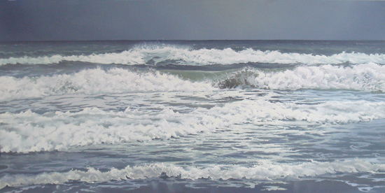 |
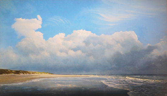
| Waves, oil on panel, 50 x 100 cm |
Subscribe to:
Posts (Atom)