Thursday, March 19, 2015

Perfect?

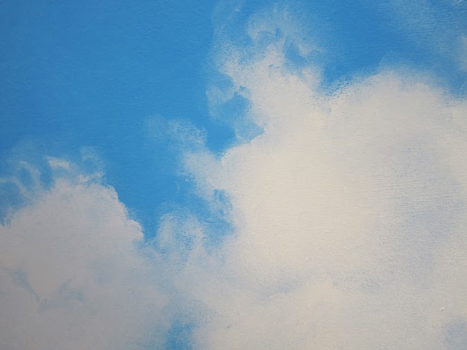
Got an email from Christian from Germany. He saw my Painting Clouds video and wrote some nice things about it. I can never get enough of that. Very encouraging.

In the correspondence that followed the topic was perfectionism and how it can hold you back. Christian wrote:"..my inner critic slows me down or prevents me from doing anything at all". Attached to his mail he sent me a cloud painting he made. Looked real good...

Ofcourse it's a good thing to set the bar just a bit higher every time you start a new painting, to set goals and all that kind of stuff. But however much you grow, you'll never be perfect. And that's a good thing. One of the joys of painting is the feeling you're getting better, that over time you've learned to master problems you couldn't handle before. If you could be perfect, you would loose that. Boring.

At the end of a work day I often ask myself: did my painting get better today? Most of the time the answer is yes. If I'd ask myself: did it get perfect today, the answer certainly would be no. You gotta ask the right questions.

Painting is an excellent way to get in a state of flow. For a few hours there's just you and the painting. In 1975 a guy with a funny name (Mihaly Csiksgentmihalyi) wrote a great book about it, called 'Flow'. One of the conditions to enter a state of flow, he writes, is that the task ahead of you may be difficult, but you feel you can do it. In other words: match your challenges to your skills. And do the hours, I'd like to add.

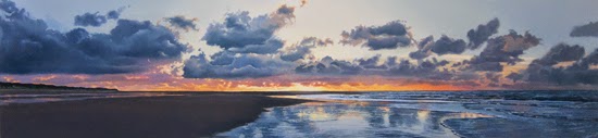
I just finished this sunset. Succeeded to paint the movement of the water, with the little ripples and everything, on top of a ground layer. Tried it before but it didn't really work. I didn't match my challenges to my skills, I guess... 
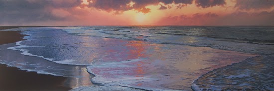
Sunset, oil on panel, 50 x 150 cm

Friday, March 6, 2015

Grisaille

Some of the painting techniques I use have a long history. Glazing for example (where you paint transparent layers on top of each other) dates back to the 15th century. In my Painting Clouds video I explain what it meant to me when I first learned about it. 

Another technique I sometimes use is the 'grisaille'. The French word 'gris' means grey and that kind of sums it up. The painter limits his palet to black, white and grey. A lot of 15th century triptych doors have a grisaille of a saint at the back. In the 16th century it was Leonardo da Vinci, I think, who was the first to use the grisaille as an underpainting. 

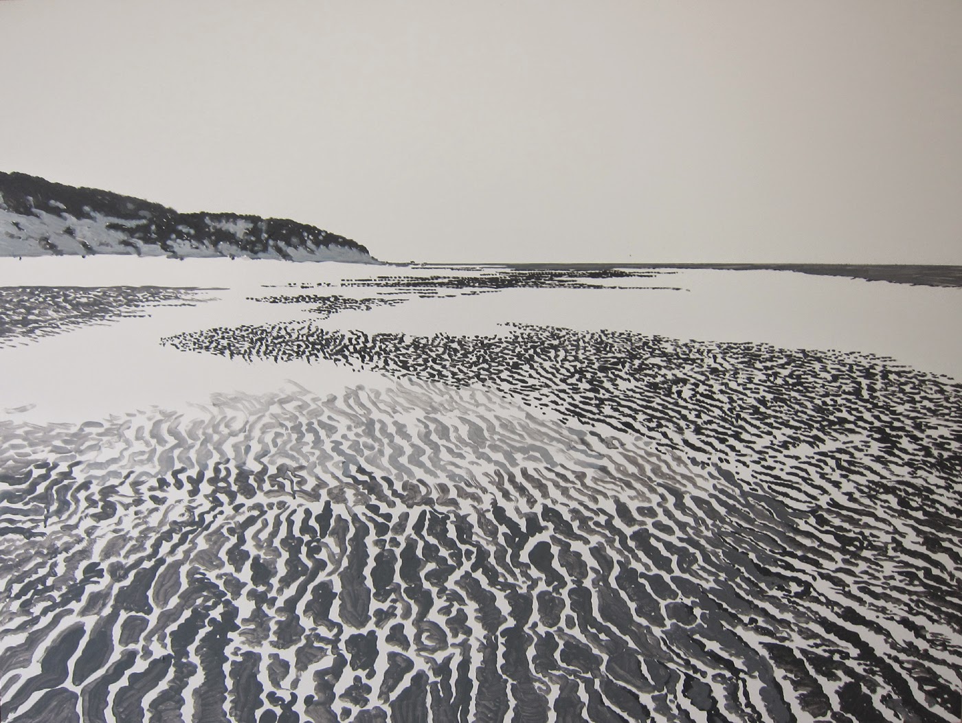
By doing so he was able to tackle the problems of volume and composition, without having to bother about color. In combination with glazing (to apply your colors) it's a really powerful tool. It gives you maximum control, because you build up your painting step by step. It takes a lot of planning and patience though. If you're the 'I-have-to-spontaneously-express-my-feelings' kind of painter this is probably not the right technique for you.  
In my painting After the Storm I was very keen on getting the structure of the sand right, so I painted it in detail with black and white acrylics. Then I slowly built up my colors with oils. Even though the black and white structure almost disappeared in some areas, you can still see it shimmering through the top layers. On your computer screen there's probably not a lot left. That's what happens when a painting of 90 x 120 cm has to fit on a laptop screen... 
Anyone tried this? Let me know!


Thursday, February 19, 2015

Horizons

I find myself more and more attracted to oblong panels. It's hard to pin down exactly what I like about them so much. It probably has to do with the character of the landscape I'm painting. Those of you who visited the Netherlands know that it's as flat as a pancake. The closest thing to a hill is an overpass. And even our defense line against the ocean, the dunes, have a strong horizontal aspect. And it's this aspect that's fits in with really well with an oblong format.

Beach with Tyre Tracks, oil on panel, 150 x 50 cm

Sunset, oil on panel, 150 x 35 cm

This coming June I got a solo show in The Hague (the Netherlands), where I hope to show a number of these panels. Let me know what you're thinking!

In the meantime work on the new video is steadily progressing. We got a new HD camera. Amazing quality. Can't wait to present the footage. Have to be patient though. It'll take at least a couple of months before it's ready. What I can show you though is a clip that'll probably be in the video. It's on the subject of color mixing, especially about how to mix colored greys. Fairly technical, but if you're into painting it might be interesting. Don't hesitate to contact me if you have a question!


Thursday, February 5, 2015

Reflections, the video

A few weeks ago we started shooting the second long play video after 'Painting Clouds'. Don't know when it will be released, but it will take a few months. Awful lot of work. The title will be 'Reflections'.

The video will show me working on a 120 x 90 cm painting of a beach with clouds reflecting in the wet sand. Last year I made an oil sketch of the subject and I was curious what it would be like on a large panel. Some of you may remember I wrote about it in 2014 in my 9 Oct post.

Oil sketch, 40 x 30 cm

The title also refers to short intermezzi in which I will reflect on what inspires me, much like the latest video I posted on YouTube.


I found some really funny drawings I made as a five year old. I'll show a few of them in the video. I can clearly remember the moment I drew them. How hard it was to get them right and how dissatisfied I was with the results. Some things never change... Here's one to give you an idea.

Shells, ball point, 1956

Painting with a camera in your neck is a strange experience. At first I was aware of every move I made, but I'm slowly getting used to it. The camera man is a close friend, who also shot the Painting Clouds video. He knows how I work, so there are very few interruptions in the painting process.

Of course there is always a possibility the painting goes horribly wrong and we'll have to start all over again. That would make an interesting video: 'How not to paint reflections'. We'll see.

I'll keep you posted!

Thursday, January 22, 2015

Canvas or board?

Got several emails with questions about the surface I paint on. The short answer is: 6 mil. MDF panel, mounted on a wooden frame to prevent curvature.

The long answer is: I used to paint on canvas, but the texture of the fabric started to bother me. I wanted the decision to be up to me, wether I needed a smooth or a textured surface. So I started painting on wood. I used to prepare my own (masonite) panels. Grounded them with Gesso (a Talens brand) and a brush. Watered the Gesso down in the first three, maybe four layers. Less water in each following layer and you avoid "gumming-up". I used very fine sandpaper to smoothen each layer, always with lots of water. To speed up the drying process I had a hair dryer on stand by. To tell you the truth: I hated it, it was an awful lot of work. The results were great though.

Now I don't ground my own panels anymore. I found a guy here in Holland who does a great job preparing MDF panels. Smooth surface like you've never seen. At first it was hard, painting on his panels. Very slippery, made me feel uneasy. But over time I found a technique based on layering that allowed me to do just the stuff I had in mind.

 I did a 70 minutes video (Painting Clouds by Layering) that tells the whole story. Here's the trailer.


Thursday, January 8, 2015

Photographs

A positive comment I often get is "Your paintings look just like photographs'. A negative comment I often get is "Your paintings look just like photographs'. Same phrase, opposite meaning.


Painters have always used the technical possibilities of their time to make their work look as real as possible. The 17th century Dutch painter Vermeer used an ingenious lense system and the 19th century Impressionists were keen to use the newly invented camera. In the 21st century painters use digital cameras and computers. A few years back I made a YouTube clip called 'The computer is a painter's best friend'. It's a small demonstration of how I use Photoshop to design my paintings.


Ocean with Evening Clouds, detail
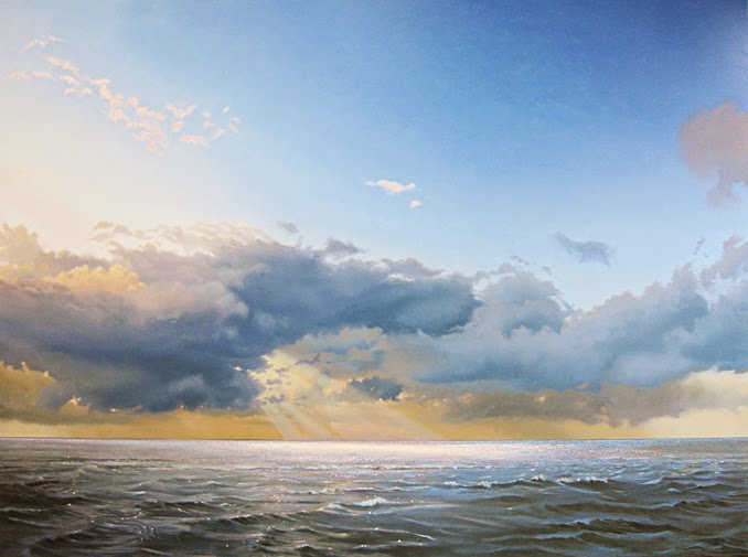
 Seen from a distance my work may seem photographic, but when you look up close, you'll of course see that it's not. That's why on my website (at least in the 'recent work' section) I always include two or more details when I put a paintng online. Sometimes these details become almost abstract. Dots of paint and small brush strokes that you don't see from a distance, let alone on a computer screen.


Ocean with Evening Clouds, oil on panel, 120 x 160 cm
Got an email a while ago from a guy who just saw one of my paintings: "This was only a painting, but it made me feel the same way as I had just done on the beach" This is a great compliment and it sums up what I'm after: make a painting that mirrors the feelings I have when I'm in this landscape, wether it's standing in awe for the grandeur of nature or simply enjoying the beauty of it all. For me realism is the way to achieve this, or at least get as close as possible. Mission impossible ofcourse, but I just love to keep trying!


Friday, December 26, 2014

Tracks

Been working less than I planned. You know how it is these last days of the year. Don't get me wrong, I love the family visits, but it's not easy painting with a bunch of kids playing in the studio.
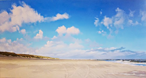
Still I managed to finish the painting I've been working on for a while. It's quite big: 80 x 150 cm. I love the large formats. They give a sense of space you don't get on the small ones.

Tracks, oil on panel, 80 x150 cm

I'm writing about this particular painting because I used a different method to paint the clouds. In the first stage I did the blue of the sky, with it's transition from a greenish- to a darker blue. It took me two days and a number of layers to get it right, but that was worth the trouble. The transition gets much smoother and the colors more intense. The next day I did the first layer of the clouds in a mid tone, much like the cloud on the right side of the painting. Used my thumb to give the edges a fluffy look. In the next few days I slowly built up the white of the clouds (Titanium White with a little Vermillion Red to be preciese), using the initial mid tone for the shadow parts.

I use this method mainly for free floating clouds against a blue background, but I think I'm going to try it for more overcast skies as well.

Well, that's it for now. Hope you're enjoying the Holiday Season. All the best for you and your loved ones for 2015!