Friday, January 17, 2014

The Ruysdael Project (2)

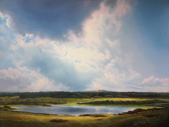
View of the Vlieland Lighthouse, 120 x 160 cm, oil on panel

You may wonder where the lighthouse is. It's the dot on top of the dune in the centre of the painting. I'll help you out.


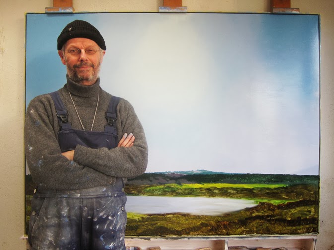
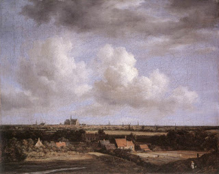
There it is. It's been quite an experience, this attempt to paint a tribute to one of my favorite landscape painters Jacob van Ruysdael.The hardest part was the landscape itself. It had been a while since I painted a panoramic view like this. One of the things I stumbled into was how much detail I should add (in particualr in the foreground), and at the same time not loose track of the big picture. 


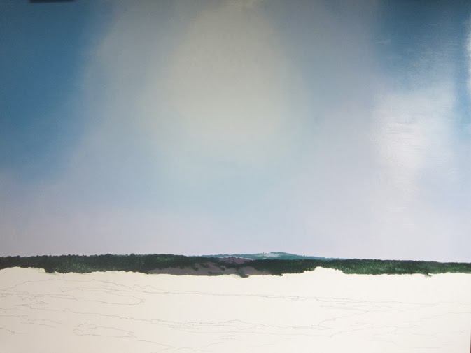
I decided to go with the pointillistic approach: painting dots in different shades of green on top of the underpainting. That worked really well to light up certain areas, but I was looking for more refinement. So I paid a visit to my local retailer and I found a fantastic brush: a core of sable hair with squirrel on the outside. Squirrel is often used for water color brushes, because it retains a lot of water. In this brush it serves as a reservoir for the sable. It enabled me to create a network of subtle lines in the foreground, just like I wanted. 
 

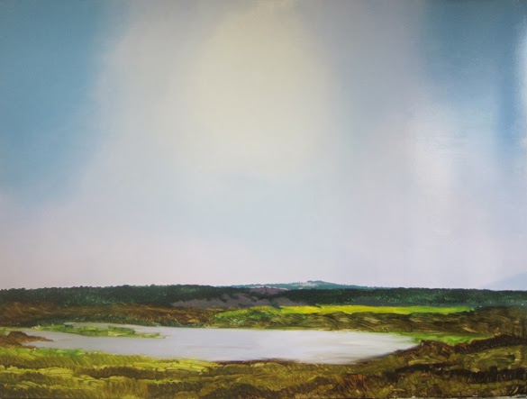
 In my previous post I told you I wasn't sure about the water, but in the end I decided to keep it. It connects the sky to the landscape. In one of Ruysdaels Views of Haarlem (he made several) there is water too. Happy coincidence. 


I just finished a 2 minute Youtube video showing the different stages of the painting. I also posted a bigger picture on my website (www.paintingskies.com), with more up close details. In April 2014 it will be part of an exhibition in the Møhlmann Museum (The Netherlands).

Let me know what you're thinking!


Saturday, December 14, 2013

The Ruysdael Project

I'm a genuine webshop owner these days. My Painting Clouds video is online since early June 2013 and now my oil sketches are available online too. And with some succes, I must say. Really pleased with it.

I'm still working on the Ruysdael project I told you about earlier. I finally made a choice which of the oil sketches I'd use for the big painting (120 x 160 cm). I decided on the one with the pond and the clouds in backlight. (Check my previous blog for that one. Thanks for the advice, John.) These last few days I've been working on the underpainting. I took a snapshot of me in front of the piece, to give you an idea of the size of the thing. I just had a hair cut. Gave me a cold head, hence the headgear.
 
I decided to paint the blue of the sky without outlining the clouds first. When this layer is dry I'll paint them on top. It's a different approach, compared to the video, where I left them blank in the first stage. The clouds I'm gonna paint on this background are not as massive as in the video and I want the blue of the sky to shine through in some spots. I will have to use my fingers and my cloth to get the edges right. Can't work them into the blue of the sky once the paint is dry. Sorry for the annoying reflections on the right side of the pictures. The paint was still wet when I took em.   

Next I laid down the first layer of the landscape. It's a view at Vlieland, my favorite Dutch island. The lighthouse sits on top of the dune in the distance. That'll probably be one of the last things I'm gonna paint. Got to get the sky right first, before adding a detail like that, no matter how important. 

The first stage of the landscape is done with a wide brush, no details, just to get an idea. I'm not sure if I'm gonna keep the water. Don't know how it'll work out once the sky is finished. In reality the water comes and goes too, depending on the rainfall. 

I'll keep you posted!


Monday, November 18, 2013

Online sale


Thanks for your entries for the free oil sketch contest. You brought a smile to my face with your funny, moving and sometimes sad stories. I had a hard time picking a winner. I narrowed it down to a top ten, then to a top three and I finally decided that Hinke (from Holland) should have the sketch. I will send the runners up (John from Scotland and Grant from the U.S.A.) a little present too.

I've been thinking about selling my work online for quite some time. This silly contest was in fact the last push I needed. I now have a brand new online sales page, where you can purchase my oil sketches. The big paintings will still be sold through the galleries, but if you're looking for a modestly priced oil-on-paper, you may want to take a look.


In the meantime I've been working on the sketches for my Ruysdael project. I'm making good progress and really enjoying it. Kind a liberating, not to plan the whole thing in advance, but just go for it. I think I'll make a few more before I decide which one to use for the real thing. I do have a slight preference though. Which one would you pick? Let me know! 

I use a small water color tablet for my oil sketches. Before I start painting I prime the paper with a few layers of Gesso. To give it just a bit of texture I work the surface with a paint roller.

If you  feel like seeing the whole lot, please visit my online sales page.


Monday, October 28, 2013

Oil sketch for free?

Every now and then I get an invitation to participate in an exhibition with a special theme. I'm not always keen to participate, because of the obligation to create a special piece, often with a certain subject. I cherish the freedom to paint what I feel like.

But the invite I got last week is an exception. The exhibition is titled 'Looking Back in Admiration'. Participants are supposed to make an hommage to an artist they admire. I immediately thought of Jacob van Ruysdael with his 'View of Haarlem'. 

Ruysdael is a 17th century Dutch landscape painter and one of my all time favorites. Learned a lot from the guy, mostly how to create depth by alternating light and shadow. What I like about his Haarlem painting is the high viewpoint, it makes you feel you could step into the frame and wander around the landscape. I tried my hand at this type of painting more than once. The piece on the right is an example, a view of the island Vlieland, seen from the lighthouse.

Working on some ideas at the moment. Made a small oil sketch on paper (18 x 24 cm). It's a view of the island Ameland. The horizon is at the same height as in Ruysdael's painting and the lighthouse is at exactly the same spot as Ruysdael's church. Gonna do some more of these sketches. In the end I want the painting to be real big, 120 x 160 cm maybe. The exhibition opens in April 2014 in the Møhlmann Museum (www.museummohlmann), a privately owned Dutch museum for realist art. 

Now, if you're interested in owning the oil sketch, please send me an e-mail (info@janhendrikdolsma.nl) explaining why you're the one that should have it. The independant jury (with one member: me) will announce the winner in about a month.


Thursday, September 26, 2013

Stuck on a painting

These last few weeks I’ve been working on a painting for the December issue of ‘Atelier’, a Dutch art magazine. They invited a number of painters to take pictures of the different stages of a painting and explain their technique. Ofcourse I said yes when I was asked (vanity, oh vanity…), and now I’m struggling with a painting and a deadline (October 1st).


The problem with these situations (similar to a commission) is that you loose the freedom to totally change direction when you get stuck. How many times did I not grab a big brush and covered the panel (or parts of it) with a fresh layer. It often presented me with new options. Options I wouldn’t have seen, had I tried to remain in control.

The problem with this particular painting was the blue of the sky. It needed a soft quality, that I just couldn't get right. Not a saturated blue, but a toned down milky blue. I finally found a solution by mixing transparent white with a hint of prussian blue. I applied it on top of the initial blue in a transparent layer and that began to look like it.


This was about a week ago and I thought I was looking at a finished painting. I started taking pictures for the article, but again I struggled with the blue of the sky. It had a green hue and even Photoshop couldn’t help me out. So I asked a photographer-friend to give it a shot and the results were still not okay. Now I’m thinking that the photograph is not the
problem, but the painting itself. Anyway, please take a look at it and tell me what you think…

Beach In Winter
50 x 65 cm

Tuesday, August 20, 2013

A wall of paintings

 One of my favorite Dutch galleries is De Twee Pauwen Gallery in The Hague, situated in the old centre of the city. I’ve been working with them since 2006 and since 2007 they hosted a number of my solo showings, the most recent in May this year. They specialize in large sizes, one of the few venues in the Netherlands that still do.


After having completed the collection for the May exhibition, I felt like something completely different. And now I got my own wall of tiny paintings…


When I feel like trying something new, I often fall back on smaller sizes. This time I wanted to experiment with a medium that was rather new to me, Liquin Light Gel, by Winsor and Newton. Great stuff, especially for glazing.  It took me some time to get used to it. I found it hard to handle at first. But after using it in some of my small panels I can’t say anything else but: great stuff.


Monday, July 15, 2013

Painting a cloud that looks like a real cloud

 Some time ago I stumbled across an old painting, done just after I graduated from Fine Art College. It was a beach scene, with a huge Cumulus. The cloud looked as if it was made out of concrete, challenging the law of gravity. I have vivid memories of how I struggled back then, trying to make a cloud look like a real cloud.


Now, more than thirty years later, I know that the edges are extremely important to create the soft and fuzzy appearance I was looking for. Almost every cloud has a soft edge, a transition between the blue sky and the cloud itself. I’ll work on that at an early stage, when
the blue of the sky is still wet.

 Later on in the painting process I’ll add details to the edges. They too are pretty important in order to make the cloud look real. Little bulges and dots that got separated from the big cloud, interrupt the shape and give it a sense of movement.


Using my fingers instead of a brush also helps tremendously. I don't have to buy new ones and they're available all the time.