

Now I don't know about you, but I never heard of Indanthrene Blue. It turns out to be a valuable addition to my palette (I told you, she knows what she's doing!). I hope the above picture gives you an idea, but I'm afraid the intensity of the color will get lost on the screen. It's a very deep and rather warm blue, a bit like Ultramarine, but darker.
Most blues loose color pretty quick when you add white and that's a problem when you need a very light sky that is still distinctly blue. Well, this one keeps it's color, even mixed with a considerable amount of Titanium White. I used it in the beach scene below. Just added a hint of Caribbean Blue (mostly in the lower part of the sky). I am really pleased with the result. This is probably not the last time I'll use Indanthrene Blue!
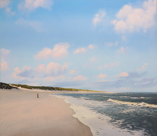 |
| Rising Tide, oil on panel, 27.6 x 31.5" |
Nice transition of blues ,like that. Sky looks transparent from my end ,even on top of the picture...Congrats on this one!
ReplyDeleteThanks Arthur! You're right about the feeling of transparency. Not only on the screen, but n reality as well.
ReplyDeleteLet's give it a try!
ReplyDeleteKeep me posted, Wim!
Delete