I finally finished the North Sea Breakers painting. Been working hard. Had a deadline to meet: the start of the Summer Show at the Twee Pauwen Art Gallery in The Hague (Netherlands) on June 29. Yesterday the painting left my studio to be framed and transported to the gallery.
In reaction to the question in my previous blog entry I got a few reactions in the mail. Thanks! One comment suggested I'd get rid of the beach pole and I agreed. When I removed it, the painting seemed to have more depth. I also softened the color of the beach. Dutch beaches are a bit pale, which goes great with the greenish color of the North Sea. For you painters out there: I used Flesh Color (Lukas), Sepia (Rembrandt) and Yellow Ochre (Old-Holland).
The weather was real nice, so I worked with the windows open. The blackbird in the yard provided the soundtrack to this YouTube video. Almost four weeks of painting boiled down to nine minutes...
Please check out my online sales page for the oil sketch that goes with the painting.
In my previous blog entry (May 30) I promised you some footage of me working on a new painting. It seems that I was a bit to optimistic as to when the thing would be finished. As I write this I'm still in the last stages, but I keep seeing stuff that bothers me, so I keep working on it. Here's the present situation:
North Sea Breakers, oil on panel, 120 x 160 m, under construction
I'm still in doubt about the beach pole. Should I keep it? The edge of the cloud in the upper left corner may still be to sharp and there are probably a few more things that I need to work on. To close to see em. If you do, please tell me!
I'll get back to you as soon as I finished the painting and the video that goes with it!
I'm working on a large painting for the Summer Exhibition at 'De Twee Pauwen' Art Gallery in The Hague (Netherlands). Their theme for this year is Water and that fits me like a glove. Thought it'd be nice to keep you posted with some footage of the painting process, starting with the design. I spent quite some time on the design of this painting. In my archive I had a photo of a beautiful April morning cloud. Couldn't get a clear shot, because of the trees in the foreground. It needed a little Photoshop magic before I could use it for my painting.
Spent a few hours in my photo archive to come up with the right sea for this sky. I was looking for a 'bright-day-sea', that would dissolve into the sky on the left side of the picture. That is a bit of a contradiction, so it wasn't easy.
After some experimenting I started to like what I had, but I felt the picture needed a warm accent, so I pasted a beach (got a lotta beaches in my archive) in the bottom part of the picture.
Please, click the play button to get a 40 second impression of the process.
I finished the design with a small beach pole in the lower left corner. It has a deep red top that adds yet another warm/cold contrast to the picture. Next time some footage of me working on the painting. That's a bit scary; there is always a possibility the painting goes horribly wrong... See you in a fortnight.
Like I promised, the nrs. 5 to 10 of my Top 10 Painting Tips. If you want to check out the first 5, please read my previous blog entry, or watch this YouTube Video.
6.
Take A Plein-Air Class.
When I was younger I spent a lot of time
painting outdoors. In the summer I took off to the Dutch islands, to paint the beaches, the dunes, the ocean and most of all the skies. I learned a lot during
these years, most of all because I had to work fast. The light changes
suddenly on these islands and before you know it, a cloud blocks the sun and you're looking at a different landscape.
What I
learned most of all is the importance of observation. Just from watching a sky
you learn an awful lot and that will be of great use later on, when you try to
paint it. It’s a bit like the old Chinese masters, who (as the story goes) sat
in a landscape for hours on end, went home and painted it in just a few
minutes. I’m no Chinese master and it takes me more than a few minutes to paint
a decent sky, but observation is the start if you want to learn how to paint
clouds.
Water color, 1998
7.
Learn Linear Perspective.
Linear
perspective is an age old way to make a 2D canvas look like it's 3D. Dates back
to the second half of the 15th century, but it's still a very powerful tool. It
is mainly used for buildings, but for a landscape painter it's very
useful too. Check out this great YouTube video
by Kenney Mencher and learn all about it.
8.
Try Different Sizes.
Do you feel comfortable with a small canvas or do you prefer a large size? Square or oblong? The only way to find out is to try. You'll be surprised by the possibilities an unusual format has to offer.
9. Change from canvas to wood, or vice versa In fact
this whole painting business is about finding out what suits you best. For example: it took me quite
some time to find out that painting on wood was the best choice for me. Turns
out I love a really smooth surface. Prior to that I worked on canvas and on
paper (still do).
Don’t
be to hasty to decide that something is not right for you. When I first started working on MDF panel it felt like I was painting on ice. But now I wouldn’t
change it for the world. Maybe you’ll have the same experience with canvas. Just find out!
10.
Try Working On A Colored Surface.
Most of us are used to working on a white surface. It has been that
way for the last couple of hundred years. But some Renaissance painters worked
on a deep red bottom layer and quite a lot of contemporary painters still
do. For example my friend Frank Speyers (USA) in his wonderful painting Kelderhouse Farm. He tells me he grounded his panel with an acrylic cadmium orange. He left the windows unpainted hence the orange shows through…"As if someone were home. Crazy eh?" he says.
Perhaps you've noticed that most of my tips deal with change and experiment. The reason of course is that the only way to find out what you're comfortable with is to try stuff. Ironically, you will probably feel rather uncomfortable during some of your experiments, but you'll also make some exciting discoveries. Have fun!
Painting is a lot of fun most of the time, but once in a while it can really ruin your mood. Whatever you try, nothing works. You're stuck and you don't have a clue how to get back on track. Here are 5 of my Top 10 Painting Tips to prevent that from happening. I hope you'll find them useful! 1. Spend More Time Designing Your Painting.
Do you know that feeling, when it seems a painting is painting itself? From the first to the last brush stroke it's smooth sailing. Some people think there is magic involved and maybe that is true, but it's probably the magic of a good design. When comparing a few of my paintings where I've had this feeling I came to the conclusion they all had one thing in common: a good design.I know it's hard to define exactly what that is, but for now, lets just say you'll know a good design when you see it. Don't settle for less.
www.paintingskies.com
2. A Great Photo Doesn't Always Make A Great Painting.
A lot of painters use photo's in their work. Nothing wrong with that. Painters have always used the technical possibilities of their time to make their images more convincing. But you can't just copy a great picture and think it'll automatically turn into a great painting. A painting often needs a little more than that. It needs a clou, a focus point. I use Photoshop as a design tool for my paintings. If you want to find out how that works, please take a look at my Youtube video 'The Computer Is A Painter's Best Friend'.
3. Make An Oil Sketch Before Starting The Real Thing.
When you're planning a large size work, it can be useful to make an oil sketch first. Somehow the transition from pixel to paint tells you if it's a good idea to turn the design into a painting. Plus you can solve some problems in your sketch, that you otherwise would have to solve in the final work.
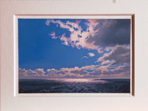
Ocean With Clouds in Backlight, oil on paper, 15 x 20 cm
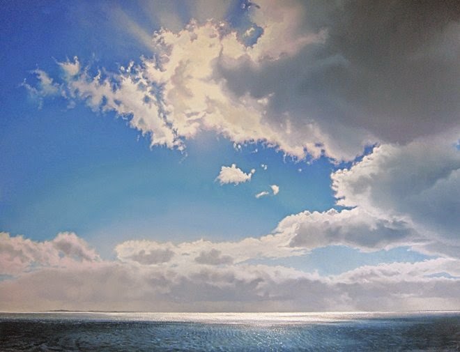
Ocean With Clouds in Backlight, oil on panel, 120 x 160 cm
4. Make A Plan.
A fellow painter once said to me: "Failing to plan is planning to fail". I don't know if that's always true; if you work in a spontaneous abstract expressionist style, you may want to avoid planning alltogether. But if you make realistic landscapes like I do, planning is pretty important. For example: I often have to make a choice between painting the clouds on a dry blue bottom layer or leave them white and paint them while the blue of the sky is still wet. I applied the latter in my Painting Clouds Video, but both approaches have their advantages.
5. Learn Linear Perspective.
Linear perspective is an age old way to make a 2D canvas look like it's 3D. Dates back to the second half of the 15th century, but it's still a very powerful tool. It is mainly used for buildings and stuff, but for a landscape painter it can be very useful too. Check out this great YouTube video by Kenney Mencher and learn all about it.
I'll be back with the second half of my Top 10 Painting Tips in about two weeks.
Till then, please post your comments or mail me at info@janhendrikdolsma.nl.
Every now and then someone asks me why I paint what I paint. Why the skies, the sea, the beaches? Good question but difficult to answer. It's hard for an artist to be perfectly aware of his real motives, so any answer will be an educated guess at best.
I could say that the root of my love for this landscape can be found in the vacations I spent as a kid on the Dutch islands. Every year we'd rent a cottage in the dunes, just a few minutes from the beach. It was the highlight of my year. Freedom to play, to swim, fly a kyte or feel the power of a storm, it was all equally amazing. Even now, almost sixty years later, I feel that same glow when I get on the ferry.
Or I could say that as an art student I found out that landscape painting was my thing. How I discovered the great masters of the past: van Ruysdael, Turner, Constable, Weissenbruch. In their work they showed the sublime, effortless character of nature. I wanted that too.
In my day to day life I don't feel sublime or effortless at all. I guess most people don't. We try hard, but most of the time we're rather clumsy. We stumble through life, get bruised and dented and we make do. Still, every now and then, we have our moments. Most of my moments are related to the islands. Standing on a high dune, overlooking the ocean and see the storm clouds gather at the horizon. Walking on the beach at sunset, with a huge cloud hovering overhead. Watching the white sails between the islands on a hot summer day. And don't forget the sounds that go with these scenes. Birds, rolling waves, the wind. Maybe that is why I paint what I paint. A reminder of what gets lost so easily in our daily routine. And of course it keeps the home fire burning...
Didn't get a lot of painting done this last week. The exhibition season is starting and I've been busy organizing transport of my work to different galleries.
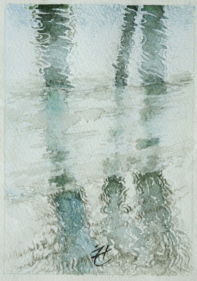
Anyway, in my last blog I promised to tell you a bit about painting reflections in moving water. In the nineties I did a series of
water colors with no horizon, only water. Very frustrating
on the one hand (it just won't sit still) but quite instructive on the other.
I wasn't interested in the results, but in obtaining a more or less
intuitive feel of the patterns.Funny thing: back then I signed my work in the middle of the picture...
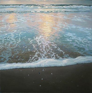
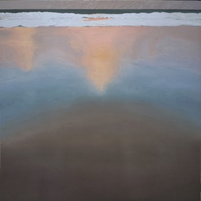
In my oils reflections play a prominent role. For example in this painting of a windy sunset on one of the Dutch islands. I made it a couple of years ago. It's a rather small panel, 50 x 50 cm. The title is 'High Tide'. The bottom layer is painted wet on wet, with an indication of the reflections, painted in subdued colors. If you make em to light, you'll have a hard time applying the lighter details later on. Don't waste your color range, slowly build it up. Find out more, if you want, in my Painting Clouds video.
The wet on wet layer is done with hog hair brushes and then smoothened with badger hair brushes. You need the smooth surface to contrast with the impasto of the details that will be painted on top if this layer.
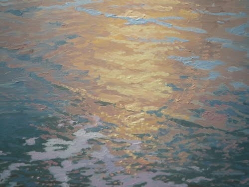
In the picture at the bottom you can see how the actual movement is caused by a
pattern of brushstrokes. Doing these details is the fun part of a painting like this. When you look at the surface up close it's an almost abstract painting.The dots are not placed randomly though, they follow the pattern of the waves.
For more details of this painting, please go to my website, click 'portfolio', then 'archive'. It's listed as nr 7, 2009.
Please, add your comments or questions. I will answer them as soon as possible!


