Friday, August 29, 2014

An oil-painting a week

Where would we be without the internet? For an artist like me it's a great way to get in touch with my audience. It's one of the reasons to write this blog and to sell my video and oil sketches online. 

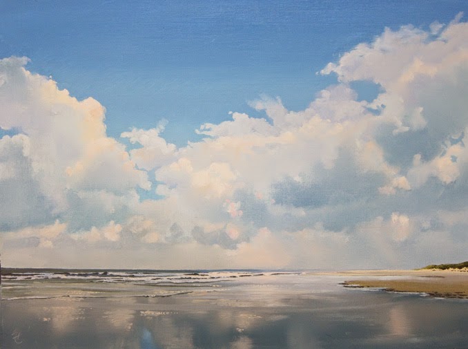
Today I'm going to launch a new blog: An Oil Painting a Week. I plan to present a new painting every week on Friday.  Each painting has the size of a picture postcard and comes with a small black aluminium frame. It can be ordered with a mouse click for a modest price. I'd really like you to check it out and let me know what you're thinking!

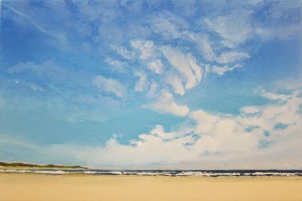
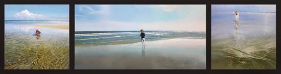
Beach with Cirrus Clouds, 10 x 15 cm (3.9 x 5.9"), oil on panel


In my July 18 blog entry I already told you I was working on this series. Posted an example, which I thought was finished. But you know how it is: after a few days your perspective  changes, so I started working on the thing again. Now I really think it's finished. If you like, you can compare it to the July 18 version. Did it get any better? Let me know!

A size like this comes with specific challenges. On a 3.9 x 5.9" panel (it's really tiny...) you can't maintain the level of detail of a larger painting. So I had to stick to the real important aspects: color, light and space. I taped the making of 'Beach with Dark Sky' and posted it on YouTube


Friday, August 15, 2014

Reflections 3

Sunset, oil on paper, 30 x 40 cm
Been working on some new oil sketches. Got a solo show in 'De Twee Pauwen' Art Gallery in The Hague next spring (one of the few Dutch galleries that still sell large works). Making sketches is a great way to find out if an idea has enough potential to turn it into a big painting.

Some of you may remember previous blog entries about painting reflections. In my sketches I use yet another approach. It's simple, but very effective. Might try it in a big one.


Reflected Clouds, oil on paper, 30 x 40 cm
Firts step is painting the reflections area in a midtone, in this case a greyish blue. Then I added the lighter colors (in vertical strokes) and the dark colors in the bottom part, all wet on wet. I slowly built it up to the right tone by adding lighter/darker colors. To smoothen the surface I used my badger hair fan brush.

For large areas I might have a problem. I use a fast drying medium (Liquin) and since this is method is wet on wet, I'll have to work fast. I'll keep you posted!

Check out my online sales page for bigger pictures: http://www.janhendrikdolsma.nl/paintings/

Friday, August 1, 2014

The Sea

Been working on the centerpiece of my triptych. Added some detail in the sea and changed it's title. 'A Day at the Beach #3' is now 'The Sea'. It reminded me of the first time I saw the sea as a kid. Must've been five years old and I still clearly remember how overwhelmed I was.

The Sea, oil on panel, 32 x 64 cm


In this painting there is quite a difference between the surfaces. The sky and it's reflection are smooth and you can't see a brush stroke. The sea and the two figures show a different approach, whith dots of paint on top of a ground layer. This ground layer is painted much like the sky and it's reflection. In this stage the water showed little movement. The dots of the second layer changed that.


The color of this second layer is also pretty important. Seen from a distance you don't want the dots to stand out from the background, you want them to more or less blend in. There are to ways to achieve this. The first is to slightly change the color of the dots. Make it just a tad lighter or darker than the background. 

The second has to do with color contrast. In this painting I used Burnt Sienna, which is a warm color compared to the blue background. I toned it down to just about the same shade as the background. If you'd take a black and white picture of it, you'd hardly see the difference. Different colors of the same tone. Works miracles.


It's still magic to me how a painting that is almost abstract, with it's dots and small brush strokes, can change into a detailed scene, when seen from some distance.


I'm also still working on the 10 x 15 series. More about that later.

Friday, July 18, 2014

Small is beautiful

We just got back from a short vacation on the Croatian coast. Great scenery, lovely weather and nice people. Now that I'm back I find it hard to get started again. The weather is hot (and that doesn't happen very often in Holland), the summer vacation just started and everything slowed down, including me.

What I did do was make a very small painting of 10 x 15 cm (4 x 6 in). I'm plannng to make a series of this size. I'll tell you later what I have in mind. 


Beach With Cirrus Clouds, oil on panel, 10 x 15 cm

Making a painting this small, is quite a challenge. You can't paint as many details as you're maybe used to, at least I can't. There's simply not enough room, unless you're painting with a one haired brush. So you're forced to leave the details out and at the same time produce a painting that convincingly suggests light and space. I may need some more practice...  

Taking a short vacation also gave me a fresh look at my tryptich. In my previous blog entry I told you about the doubts I had about the left- and right wing. These doubts simply vanished. What a little distance can't do...

Saturday, July 5, 2014

Breaking my own rule

Those of you who are familiar with my work know the human figure doesn’t play a prominent role in it, and that’s an understatement. Still, for some resason I don’t really understand myself, I lately painted an image with a human figure in it. A woman in white, strolling along the beach, her feet in the water. I called it ‘A Day at the Beach’. 

A Day At The Beach #1, oil on panel 32 x 32 cm

Then I got the idea I could maybe make ‘A Day at the Beach’ triptych. The second painting was a little boy, playing in the water. Totally absorbed in his play, like children can.

A Day At The Beach #2, oil on panel 32 x 32 cm

I usually have a pretty detailed plan before I start working, but not this time. I had the right- and the left wing of my tryptich and all I needed now was a centerpiece. I searched my photo archive for an idea, but nothing came up and I let the whole thing go.

Last May me and my family spent a short vacation on one of the Dutch islands and I took a picture of my grandson and his dad walking towards the sea. There it was, my centerpiece!


A Day At The Beach #3, oil on panel 32 x 64 cm

Now I got another problem. I’m really content with the centerpiece, but it doesn’t go well with the right and the left wing, I think. That’s what you get if you don’t make a plan… Maybe I should start all over again and make a proper plan for the right- as well as the left wing. What do you think?


Thursday, June 19, 2014

North Sea Breakers (2)

I finally finished the North Sea Breakers painting. Been working hard. Had a deadline to meet: the start of the Summer Show at the Twee Pauwen Art Gallery in The Hague (Netherlands) on June 29. Yesterday the painting left my studio to be framed and transported to the gallery.

North Sea Breakers, oil on panel, 120 x 160 cm

 In reaction to the question in my previous blog entry I got a few reactions in the mail. Thanks! One comment suggested I'd get rid of the beach pole and I agreed. When I removed it, the painting seemed to have more depth. I also softened the color of the beach. Dutch beaches are a bit pale, which goes great with the greenish color of the North Sea. For you painters out there: I used Flesh Color (Lukas), Sepia (Rembrandt) and Yellow Ochre (Old-Holland).


The weather was real nice, so I worked with the windows open. The blackbird in the yard provided the soundtrack to this YouTube video. Almost four weeks of painting boiled down to nine minutes...

Please check out my online sales page for the oil sketch that goes with the painting.

Later!


Friday, June 13, 2014

North Sea Breakers

In my previous blog entry (May 30) I promised you some footage of me working on a new painting. It seems that I was a bit to optimistic as to when the thing would be finished. As I write this I'm still in the last stages, but I keep seeing stuff that bothers me, so I keep working on it.

Here's the present situation:

North Sea Breakers, oil on panel, 120 x 160 m, under construction

I'm still in doubt about the beach pole. Should I keep it? The edge of the cloud in the upper left corner may still be to sharp and there are probably  a few more things that I need to work on. To close to see em. If you do, please tell me!

I'll get back to you as soon as I finished the painting and the video that goes with it!