Thursday, October 23, 2014

Pedestrian with Red Jacket

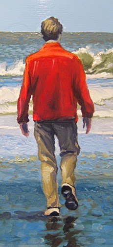
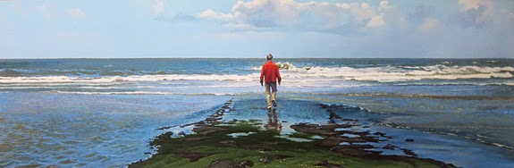
Last time I told you about the painting I was working on: a guy with a red jacket, walking towards the ocean. Well, here it is:

Pedestrian with Red Jacket, oil on panel, 40 x 120 cm

I must say, I really enjoy this new direction my work seems to have taken. I always avoided the human figure, because I wanted the focus to be on light and space. When you introduce a figure the painting becomes a narrative, like a still from a movie. The funny thing is: that is exactly what I like about it now. What on earth is this guy with his red jacket doing there?

It has been a while since I painted a human figure   (almost 40 years I guess) so I was a bit out of practice. Still I enjoyed it a lot. The problem often is to make the figure  a part of the landscape. It should not be isolated, like it's a separate world. To solve this problem I painted the background just over the edge of the figure and the figure on top of that. Of course the reflection in the water also helps. 

Feedback is welcome!


Thursday, October 9, 2014

Rømø Beach

As promised in my previous blog entry, here's an oil sketch of a beach scene on the Danish island Rømø.


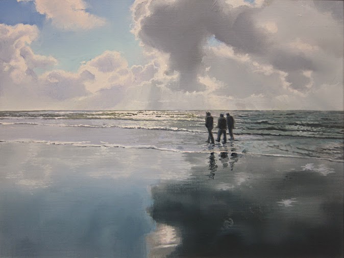
Rømø Beach #1, oil on paper sketch, 30 x 40 cm

Maybe you remember the triptych I was working on last July. Each of the three images had a human figure in it, which is quite exceptional for me. Since then I've been thinking about doing more of that. Got some encouraging reactions to the triptych and  when I showed it in an exhibition at the Møhlmann Museum (a privately funded museum of contempory Dutch realism) all three paintings were sold within a week. 'I must be on to something here...' I thought. Lots of different ideas went through my head and at the moment I'm working on a painting with a guy in a red jacket walking towards the sea. Hope to show you the result in my next blog.

Rømø Beach #2, oil on paper sketch, 30 x 40 cm

Anyway, I wondered what the Rømø sketch would look like with a few figures in it. 'What's the worst that can happen' I said to myself and I added  three guys walking on the beach. I'm not sure about the result. Did it get better? Please let me know what you're thinking!

Thursday, September 25, 2014

Reflections #4

I keep coming back to this theme. Must be the time of year... 

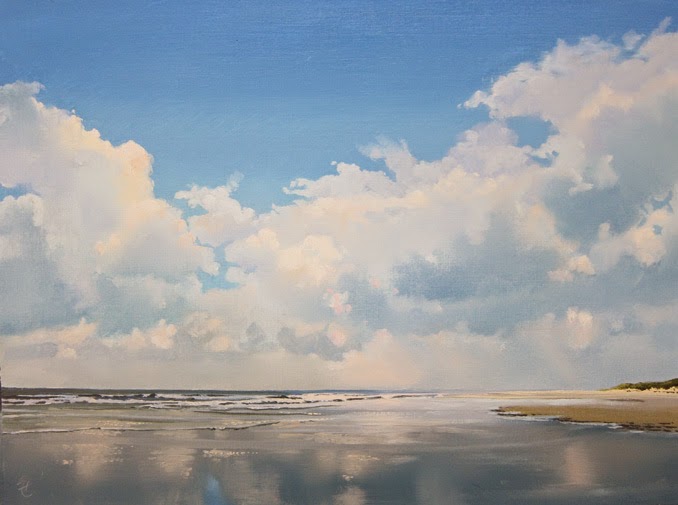
Reflections, oil on paper sketch, 30 x 40 cm
I'm considering the idea of making a second 'how-to' video, this time on how to paint reflections. Some of you may have seen my first video (how to paint photo-realistic clouds). It was released in June 2013 and I had so much fun with the comments I got from all over the world that it gave me a taste for more. What's holding me back is the fact that it's an awful lot of work. I'll talk it over with my friend the cameraman and we'll see.


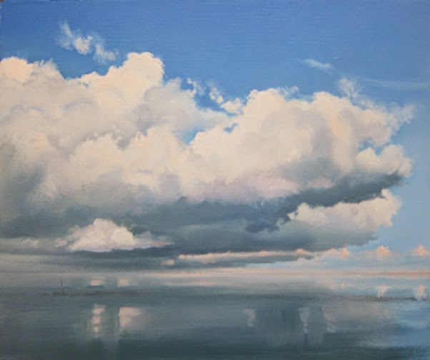
Cumulus Clouds, oil on paper sketch, 30 x 40 cm

In the meantime I made two more oil on paper sketches. I plan to make some more in preparation of a large painting on panel. Last week I visited the Danish island Rømø and I saw some stunning scenes of backlit clouds reflected in the wet sand. Made me feel like driving home, get into my studio and start painting. By the time I post my next entry I hope to have one or two sketches to show you.


Thursday, September 11, 2014

Painting sand

Before I get to the subject of this entry I'd like to (once again) draw your attention to the new blog I launched two weeks back: 'An oil painting a week'. If you get the chance, please take a look and let me know what you think. End of commercial.

Dunes in the Sunlight, oil on paper, 30 x 40 cm

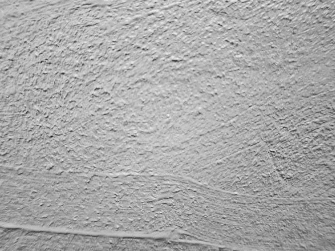
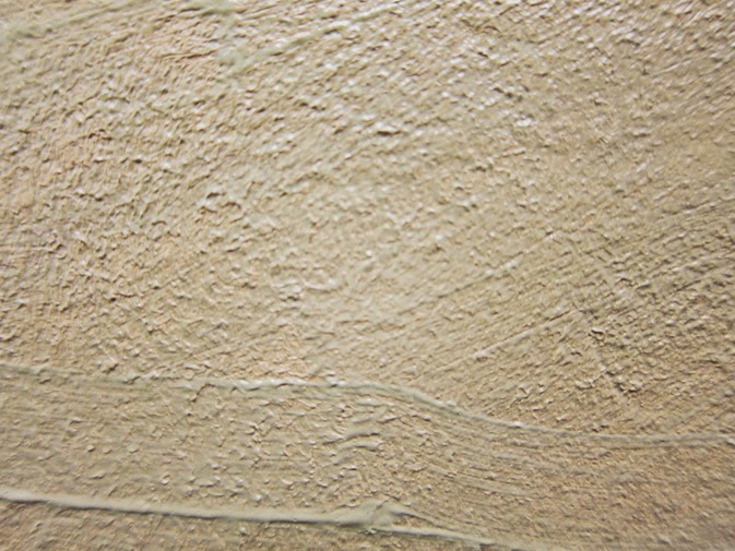
This last week I've been working on an oil sketch on paper: a dune in the sun with a blue sky and some summer clouds. I wanted to emphasize the grainy texture of the sand, so I decided to conduct a little experiment. Why not apply the texture beforehand and paint on top of that? I still had a can of modelling paste and I applied it with a palette knife. Got out my stippler and worked the paste till I got a very fine texture that looked like this:


Then I mixed a bit of fleshcolour (Lukas) with Yellow Ochre (Talens) and Bohemian Green (Lukas) and soon found out I needed a lot more paint. A surface like this absorbs paint very quickly. Took me a few layers to get it right.


Painting foliage has never been my strongpoint. This time I started with an underpainting of Burnt Sienna (Talens) and Yellow Ochre (Lukas). Once dry I painted the sand reed on top of it with my beloved saber/squirrel brush (see blog entry Friday, January 17th, 2014).
Drew some more reed in the wet surface with the stem of my brush, exposing the brown underpainting. It was a struggle, like always...

For a bigger picture of the painting please see my online sales page.


Friday, August 29, 2014

An oil-painting a week

Where would we be without the internet? For an artist like me it's a great way to get in touch with my audience. It's one of the reasons to write this blog and to sell my video and oil sketches online. 

Today I'm going to launch a new blog: An Oil Painting a Week. I plan to present a new painting every week on Friday.  Each painting has the size of a picture postcard and comes with a small black aluminium frame. It can be ordered with a mouse click for a modest price. I'd really like you to check it out and let me know what you're thinking!

Beach with Cirrus Clouds, 10 x 15 cm (3.9 x 5.9"), oil on panel


In my July 18 blog entry I already told you I was working on this series. Posted an example, which I thought was finished. But you know how it is: after a few days your perspective  changes, so I started working on the thing again. Now I really think it's finished. If you like, you can compare it to the July 18 version. Did it get any better? Let me know!

A size like this comes with specific challenges. On a 3.9 x 5.9" panel (it's really tiny...) you can't maintain the level of detail of a larger painting. So I had to stick to the real important aspects: color, light and space. I taped the making of 'Beach with Dark Sky' and posted it on YouTube. 


Friday, August 15, 2014

Reflections 3

Sunset, oil on paper, 30 x 40 cm
Been working on some new oil sketches. Got a solo show in 'De Twee Pauwen' Art Gallery in The Hague next spring (one of the few Dutch galleries that still sell large works). Making sketches is a great way to find out if an idea has enough potential to turn it into a big painting.

Some of you may remember previous blog entries about painting reflections. In my sketches I use yet another approach. It's simple, but very effective. Might try it in a big one.


Reflected Clouds, oil on paper, 30 x 40 cm
Firts step is painting the reflections area in a midtone, in this case a greyish blue. Then I added the lighter colors (in vertical strokes) and the dark colors in the bottom part, all wet on wet. I slowly built it up to the right tone by adding lighter/darker colors. To smoothen the surface I used my badger hair fan brush.

For large areas I might have a problem. I use a fast drying medium (Liquin) and since this is method is wet on wet, I'll have to work fast. I'll keep you posted!

Check out my online sales page for bigger pictures: http://www.janhendrikdolsma.nl/paintings/

Friday, August 1, 2014

The Sea

Been working on the centerpiece of my triptych. Added some detail in the sea and changed it's title. 'A Day at the Beach #3' is now 'The Sea'. It reminded me of the first time I saw the sea as a kid. Must've been five years old and I still clearly remember how overwhelmed I was.

The Sea, oil on panel, 32 x 64 cm


In this painting there is quite a difference between the surfaces. The sky and it's reflection are smooth and you can't see a brush stroke. The sea and the two figures show a different approach, whith dots of paint on top of a ground layer. This ground layer is painted much like the sky and it's reflection. In this stage the water showed little movement. The dots of the second layer changed that.


The color of this second layer is also pretty important. Seen from a distance you don't want the dots to stand out from the background, you want them to more or less blend in. There are to ways to achieve this. The first is to slightly change the color of the dots. Make it just a tad lighter or darker than the background. 

The second has to do with color contrast. In this painting I used Burnt Sienna, which is a warm color compared to the blue background. I toned it down to just about the same shade as the background. If you'd take a black and white picture of it, you'd hardly see the difference. Different colors of the same tone. Works miracles.


It's still magic to me how a painting that is almost abstract, with it's dots and small brush strokes, can change into a detailed scene, when seen from some distance.


I'm also still working on the 10 x 15 series. More about that later.